What is AWD? 5 Great Adaptive Web Design Examples for Inspiration
Replacing the PC devices, the mobile is becoming the most popular devices to access the Internet. So web designers encountered a problem that how to present the same web page on different sized devices? Don’t worry, the emerging of adaptive web design fixed this problem perfectly. This article will introduce some basic knowledge and great adaptive web design examples.
1. Principle: What is the Adaptive Web Design?
In 2011, a web designer, Aaron Gustafson, gave a definition of Adaptive Web Design (AWD) in his book, Adaptive Web Design: Crafting Rich Experiences With Progressive Enhancement. It is also known as progressive enhancement of a website.
Adaptive design means to create a different page for different types of devices, the current AWD web pages are targeted at these resolutions (320, 480, 760, 960, 1200, 1600).
Unlike responsive web pages (RWD), adaptive design is based on breakpoints using static layouts. RWD Is Not AWD, once the page loaded, it can no longer be automatically adapted, and the auto-detect will automatically detect the size of the screen to load the appropriate layout. Therefore, when you visit the website on your computer browser, the site will automatically detect and select the best layout of the desktop screen.
2. How to make adaptive web design?
The basic web design covers several important aspects:
Prototype design with fast prototyping tool like Axure, Mockplus,
UI/UX design
Front-End development: HTML, CSS, JS.
Back-End development: Java, PHP, Ruby, etc.
While the great adaptive web design needs to follow the following steps:
Step 1: Meta tags
In order to adapt to the screen, many mobile browsers will put the HTML page in a larger viewport width (usually greater than the screen width), you can set the viewport meta tag. The following viewport meta tag tells the browser that the viewport width is equal to the device screen width and does not initialize:
<Meta name = "viewport" content = "width = device-width, initial-scale = 1.0">
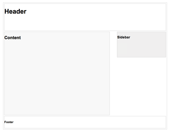
Step 2. HTML Structure
In this example, the page layout includes Header, Content, Sidebar, and Footer. Fixed height is 180px, the content width is 600px, and the sidebar width is 300px.
Step 3. Media Queries
CSS3 media query is the key to adaptive web design, just like the conditional statement in a high-level language, telling the browser to render the page according to the different viewport width.
3. Adaptive Web Design Examples
Some people said the responsive design is failing mobile UX. While currently, lots of websites have configured themselves to be mobile-optimized websites as they adopted adaptive web design on PC and mobile devices. For example, Amazon, USA Today, Apple, and About.com. But the layout of the adaptive design of the mobile devices may be different from the desktop version. So, when doing adaptive web design, web designers have much more work to do to meet the at least six different layout requirements.
Here are 5 excellent examples of adaptive web design for reference.
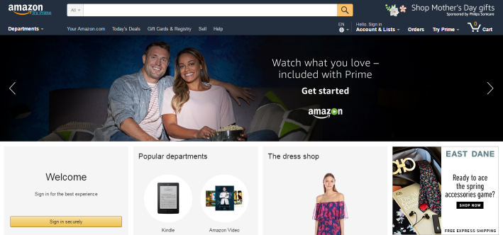
1. Amazon
Similar to other sites using adaptive web design (such as CNN), Amazon encourages users to download their branded applications. It is reported that, adopted the adaptive design, Amazon access speed on the mobile devices than the previous reactive web design increased by 40%. In addition, Amazon's adaptive website provides mobile users with the opportunity to use "Amazon.com full site" on mobile devices, while the responsive design will not be available.
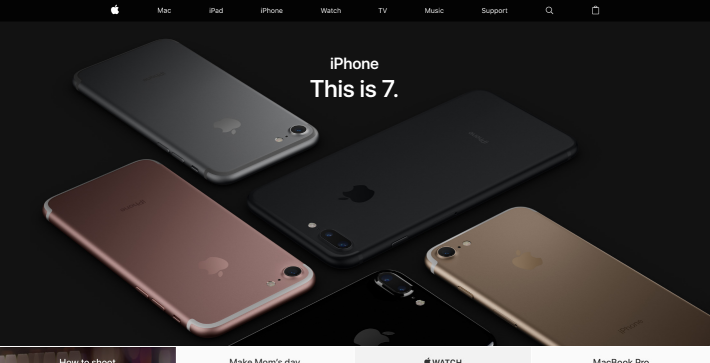
2. Apple
Apple's design has always been known for simplicity, whether it's its website, store, or product design is all reflected its clean theme. Not using responsive web design, which makes Apple suffer criticism for a long time. After all, a series of smart products is one of the reasons for the existence of responsive design. However, today, Apple uses an adaptive web design, which also means that Apple.com will make changes with the device type and function.
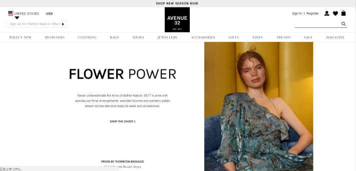
3. Avenue 32
Online luxury shopping site Avenue 32 is a model with adaptive web design. This brand features a designer working with Usablenet to create a seamless, intuitive, and highly visually appealing mobile and tablet experience. According to Usablenet, the desktop version of the site is full of content-rich web pages, including product images, designer details, curator appearance, etc., The brand must create a visual and functional experience with this desktop multi-channel network product.
"The use of adaptive web design enables Avenue 32 to highlight the discovery and business functions, which enabling customers to browse and shop anywhere," said Carin van Cuuren, the chief marketing officer at Usablenet. "And the order on smartphone and tablets have grown 40%, mobile traffic doubled, and the average mobile transaction increased by 27%. "
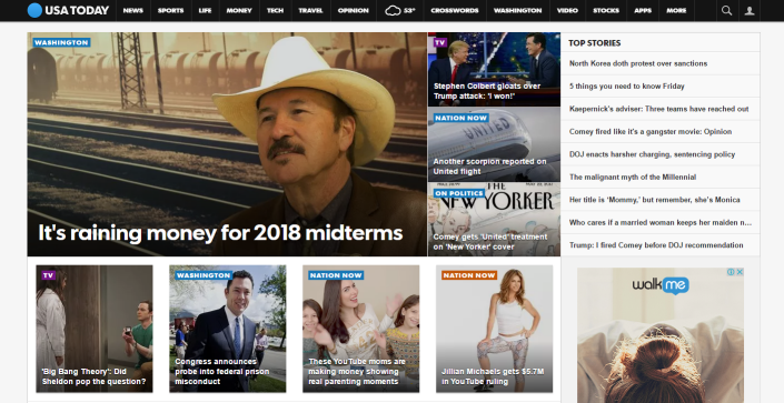
4. USA Today
The adaptive web design allows USA Today to choose an adaptive method, because the technology allows the brand to detect specific equipment by considering the operating system and screen size, in order to provide tailored experience. Therefore, providing a rich experience on news type is more popular than the responsive design.
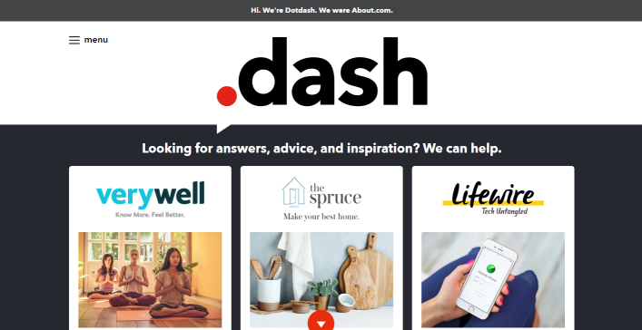
5. About.com
All kinds of news sites, like CNN, USA Today, have adopted adaptive web design because it can quickly load web pages and meet readers of all the different devices to visit the site.
The above 5 great adaptive web design examples interpreted why the adaptive web design become popular, from the different perspective, whether the web access speed, brand impact, and user experience.


Comments
Post a Comment