6 Bad UI Design Examples & Common Errors of UI Designers
Before diving deeper, let’s see what is exactly the user interface design? It’s just like I wish to feel welcomed when I visit your house, and every coming visitor of website would have such a feeling likewise.
In a simply word, user interface is how the website interacts with the user, including the human-computer interaction, interface logic as well as appearance. The usefulness of delivering the ideas and product to the user will be more important than how beautiful a website/App is.
The purpose of UI is to get the product to the user in a timely and elegant way as possible. So, you may be wondering what kind of UI design can be a good one? What are the common mistakes in UI design and how to avoid them effectively? Don’t be worry, I will walk you through them one by one with top 6 bad UI design examples included.
Differences Between Good and Bad Interface Design
There are not a few UI design principles on the web, but the top golden rules for UI design will be the 4E’ in the following. Also, this can be the standard to judge whether it’s a good UI design:
- Error-free.
- Easy to use.
- Easy to understand.
- Effective for the end goal or product.
Obviously, good UI can make us feel at home and everything out there is just in the right place; while bad UI will make you feel like having a bad taste in your mouth and all you want to do is to leave quickly.
Moreover, the bad UI design will make the users feel the website is complicated and difficult to operate; the good one will guide users how to interact with the site in a clear and intuitive way even it’s the first time for them to visit it. Not only does the bad UI design totally destroy the creativity behind the designers, but also delivers misunderstanding info to users. All of those will altogether bring users a sense of confusion, frustration and even anger. It’s obvious that bad UI design can bring about a bad user experience, you will know when taking a look at the notch of iPhone X…
Top 6 Bad UI Common Mistakes in User Interface Design
Looking at the bad design examples alongside counter-examples of good design can be fun and most importantly draws lessons for designers. As Jared Spool said, “Good design, when it’s done well, become invisible. It’s only when it’s done poorly that we notice it”. There are some common mistakes and potential pitfalls for designers, which are sometimes difficult to notice. I’ve made a list of them here for you.
1. The design lacks of contrast
When browsing a website, we’d like to see it with a clear and fresh contrast. This can help us better read and understand the info there, and thus knows how to conduct the operation. If there’s no contrast included, both of the color combination and overall display of the website will make us overwhelmed. It’s pretty difficult to read the content from the below website.
The Bad: Lack of Contrast
The Good: Contrast in Design
2. Not-responsive design
It’s pretty popular to use responsive design, cause we find there’s no reason for us to make a website which cannot adapt to the given resolution and device size. It’s a must especially for shopping cart websites/Apps whose target audiences are coming from mobile.
The Bad: Not Responsive Design
The Good: Responsive Design
3. No user feedback with plagiarism data
It’s not a bad thing to get inspirations from others’ design works, but we need to ensure we’ve had rich user data to make a right decision. The following one is a typical bad example.
The Bad: Plagiarism Data
The Good: Complete User Feedback System
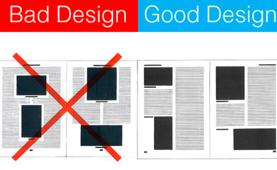
4. Bad IA (Information Architect)
Everybody wants to stand out from the crowd and his design work can appeal others’ eyes. However sometimes it just goes to the other side if we overemphasize on the creativity in the design. To keep a good balance in the visual hierarchy can leave a good impression on users, and it can deliver more info to them. The below one can give us a feeling of disorder and confusion more or less.
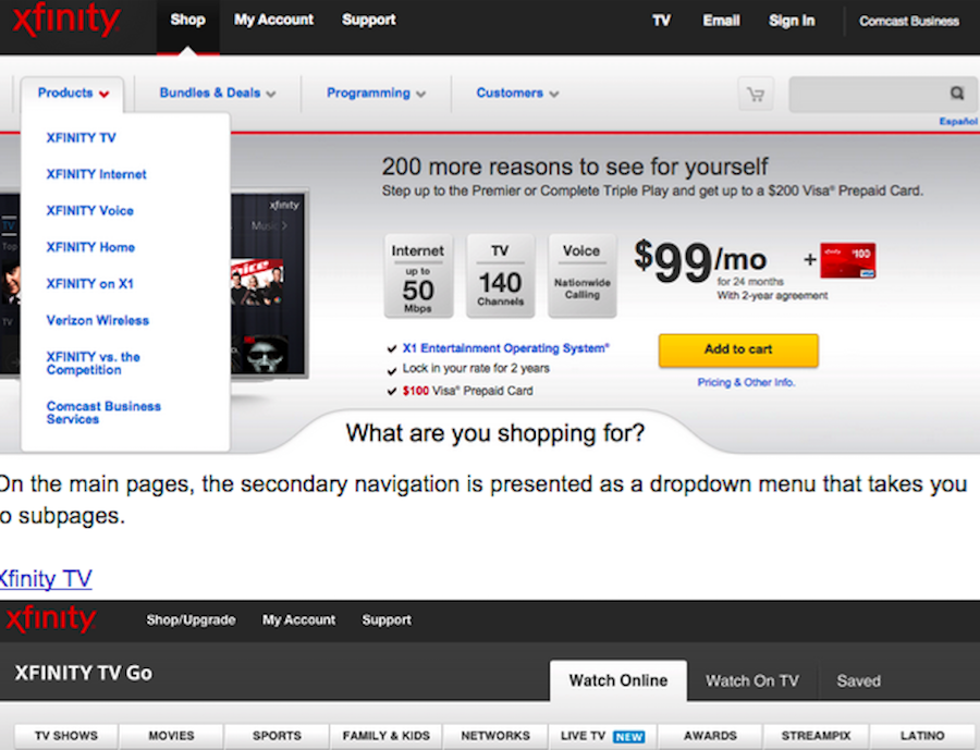
The Bad: Disordered Structure
The Good: Well-Structured Design
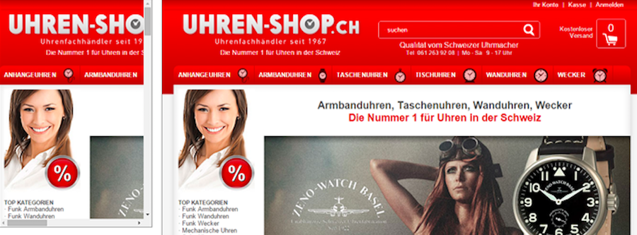
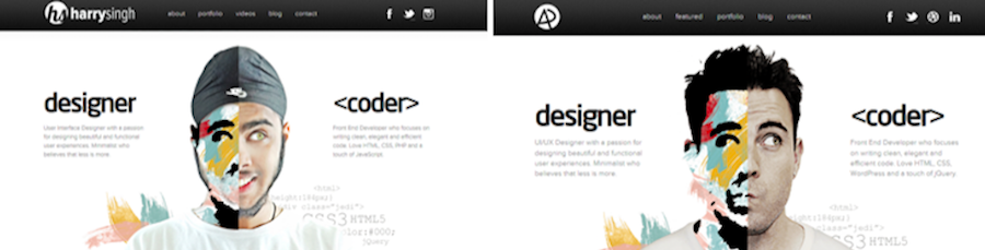
5. Inconsistent style
It doesn’t mean that the mashup style is not good, but if the overall interface has a huge and ugly visual conflict, it’s better to redesign it. An excellent UI design should be consistent on the style in order to make users clearly understand and respond to the given content. This will also do good to improve the work efficiency.
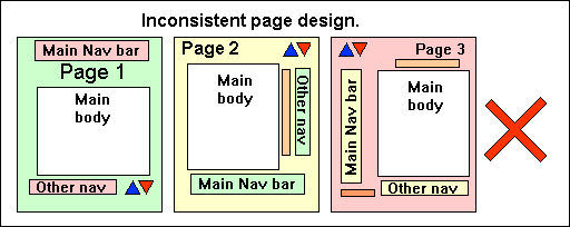
The Bad: Inconsistent Page Design
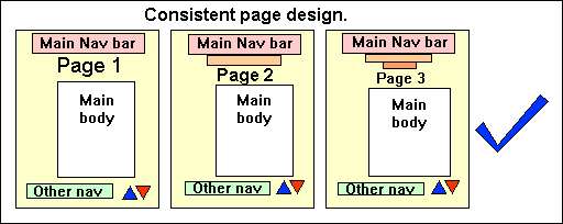
The Good: Consistent Page Design
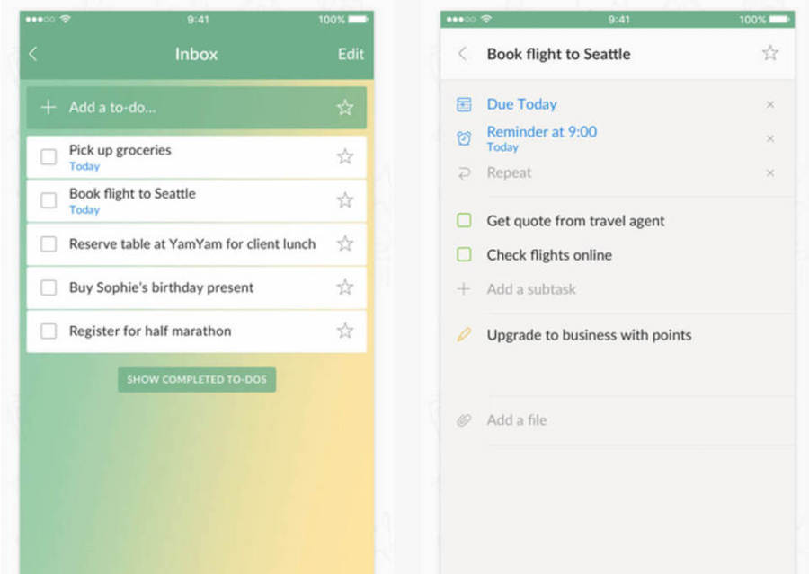
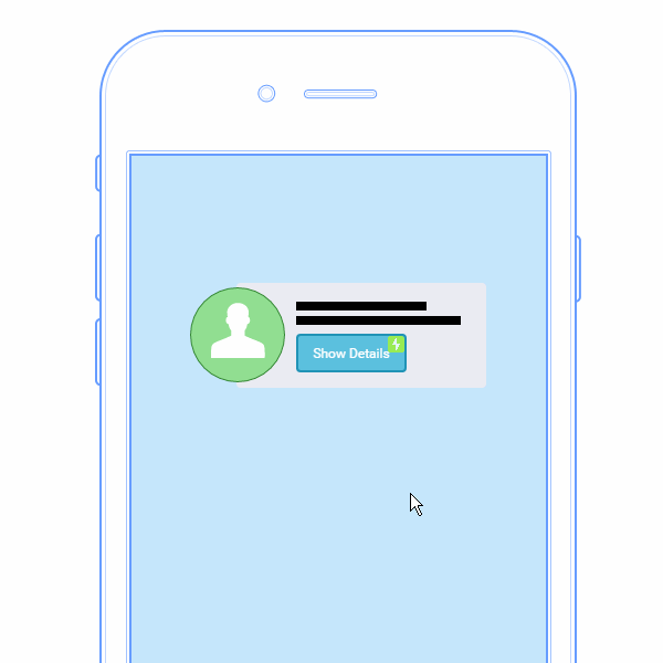
6. Clunky and sluggish form
Sometimes, we need to collect the user related info by designing a better form, but the sluggish and clunky form is totally a waste of time. It’s better to streamline the involved steps to make the form look concise and clear.
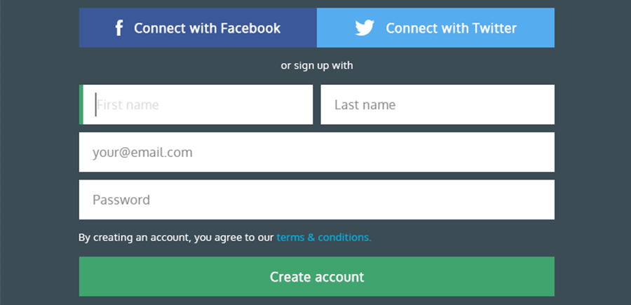
The Good: Good User Signup Form
Things like the user signup form or comment area is a social interaction element in the design. To add social sharing button (like Facebook, Twitter, YouTube and LinkedIn), or to enter the email address to sign up for the newsletter can only add the ways to spread our info, but also increase the user retention rate. We can take a good reference from below.
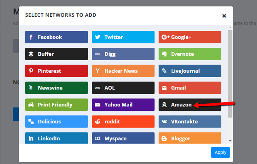
The Good: Website with Social Interaction
How to Avoid the Most Common Errors of UI Designers?
In general, there are 5 common problems that UI designers make:
- Limit the possibility to explore further. Due to the given deadline and potential risk or many other factors, not a few designers cannot make a broad exploration on the creativity before making the design plan. For the design team, a time of 3-6 months is required to locate and better the design plan.
- No user-centered design. This is the most important but easy to be overlooked part. All of the design should be user-oriented. We need more data analysis and UI resources to make sure our design ideas can be well accepted and recognized by the user.
- Know little about the target audiences. Instead of looking at personal preferences, we should put ourselves in the shoes of our customers.This will help to break the limitations of our own and thus create good selling point.
- Craft too much beforehand. Especially in the early stage of design, we want to draw out the concepts in the minds in high fidelity. However, this is not wise. To explore from more different even opposite ways can help us find more surprises.
- Make use of dynamic effect excessively. Honestly, there are many meaningless dynamic design almost everywhere, which can do nothing but bring disappointment to our users. It’s better to avoid decorative animation effect to make it optimize the user experience.
A bad example here: Unnessary Animation
Sum Up
We can draw a conclusion that a good UI design should look beautiful on appearance, but most importantly have a clear structure, pay attention to the user experience, be unique, simple and concise for users to understand. This may sound simple, right? But it’s not easy to achieve. Sometimes we can ensure there’s nothing wrong with our design ideas though, there will be a lot of unexpected things when we get started to do it. To make it happen in reality is the testing stone of personal ability.
A good design tool can not only help you showcase design ideas better, but also avoid many unnecessary operations. Here, I’d recommend you a rapid design tool named Mockplus, whose MindMap, UI Flow and project tree with multiple export formats can display the structure between pages intuitively.
- There are more than 3000 icons and 200 components to make your design better and easier
- Multiple interaction commands and component properties can make your design full of logic and animations
- All kinds of page templates and sample projects can get you inspired and design will become as easy as a breeze
It’s available as free download and there is a 7-day trial offer for any new registrants now.


Comments
Post a Comment