“Ok-Key” and “Cancel-Key”, Which One Should Be Set Up on the Left?
“Ok-key” and “cancel-key”, which one should be set up on the left? It’s an eternal war of button sort between UI designers preferring “ok/cancel” type and the adherents of “cancel/ok” type, both sticking to their own viewpoints and not reaching a consensus.
(As is said in this post regarding CTA button, setting buttons is always of great importance, and you may be risking your user conversion ratio without sufficient attention putting on it. )
Views of “ok/cancel” favorers:
1. “Ok/cancel” type conforms to our regular habits of speaking and reading. When questions are posed and there is an alternative between positive option and negative option, we tend to express it like this: “Is this your axe? Or no?”, rather than: “No? Or yes?”. In most languages, people are accustomed to read from left side to right side, so it accords with our speech habits to put ok-key on the left side of cancel-key.
1. “Ok/cancel” type conforms to our regular habits of speaking and reading. When questions are posed and there is an alternative between positive option and negative option, we tend to express it like this: “Is this your axe? Or no?”, rather than: “No? Or yes?”. In most languages, people are accustomed to read from left side to right side, so it accords with our speech habits to put ok-key on the left side of cancel-key.
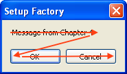
2. “Ok/cancel” type make it easier to see and select ok-key. Given that users tend to choose ok-key in most situations, if users follow the browse sequence as the picture below, this way to sort can make it easier for users to see and select ok-key. Moreover, users inured to use Tab-key to jump among buttons can save a click.
Views of “cancel/ok” favorers:
1. “Cancel/ok” type can enhance the sense of process in interaction design. Clicking on ok-key will keep operation moving on and continuing to the next section, while clicking on cancel-key will trigger backtracking without performing the operation. Putting cancel-key on the left side of ok-key is in line with the sequence of “Previous/Next” and conforms to the reading habit that moving towards the right represents carrying forward and transferring to the next one.
1. “Cancel/ok” type can enhance the sense of process in interaction design. Clicking on ok-key will keep operation moving on and continuing to the next section, while clicking on cancel-key will trigger backtracking without performing the operation. Putting cancel-key on the left side of ok-key is in line with the sequence of “Previous/Next” and conforms to the reading habit that moving towards the right represents carrying forward and transferring to the next one.
2. There’s no need retracing sight line. If ok-key is located on the left side, it’s a waste of time for users to click on ok-key when he/she needs to retrace his/her sight line after finishing reading the whole dialog box.
Representative “ok/cancel” favorers:
1. Windows
1. Windows
2. Linux
Representative “cancel/ok” favorers:
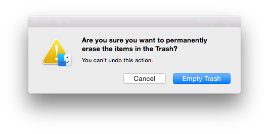
1. OSX
2. iOS
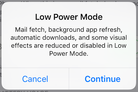
1. OSX
2. iOS
Renegade:
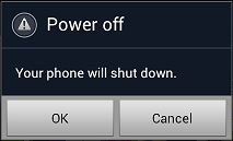
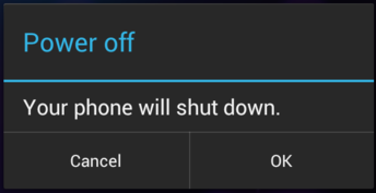
Android (has changed to “cancel/ok” type since its 4.0 version was released.)
My views:
1. So-called sight line is just some kind of psycholagny. Actually users do not read word by word from left to right but scan, especially for the two buttons situated at lower right corner. That is pattern recognition. In other words, if sequence is “ok/cancel” and the layout always stays the same, one can recognize the two options according to image features (e.g. word ok is shorter than word cancel) once he/she skims at a glance. No one may contemplate the two words in his/her mind. That is to say, all reasons based on the reading sequence are untenable.
1. So-called sight line is just some kind of psycholagny. Actually users do not read word by word from left to right but scan, especially for the two buttons situated at lower right corner. That is pattern recognition. In other words, if sequence is “ok/cancel” and the layout always stays the same, one can recognize the two options according to image features (e.g. word ok is shorter than word cancel) once he/she skims at a glance. No one may contemplate the two words in his/her mind. That is to say, all reasons based on the reading sequence are untenable.
2. It is conformity that counts. It would be best for users to use OSX in his/her computer and iOS in his/her smartphone, for he/she will never be tortured by switching his/her pattern between the two types and bear the risk of making a gigantic mistakes therefore. For UI designers, it’s of crucial importance to keep in line with operating system so as to salvage users’ time of recognition of mode.
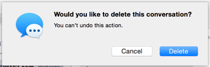
3. Use a verb in place of “ok”. It can be found that Apple chooses to use the verb of operating action in place of ok-key to heighten the effect of warning, on account of its distinctive mode in recognition, which is a wonderful timesaver.
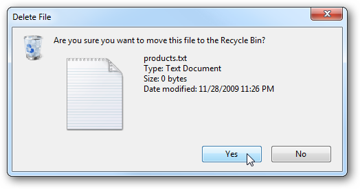
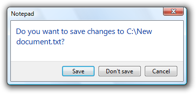
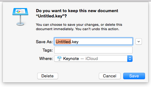
4. Put dangerous buttons away. Buttons likely to be wrongly clicked should be put a bit farther. Let’s compare Notepad of Windows with Keynote of OSX. When users want to close APP without saving changes, he/she may wrongly click on don’t-save-key whenever he/she intends to click on ok-key or cancel-key and thus fails to save his/her changes. Contrastively, Keynote puts the two trouble-proof buttons, cancel-key and save-key on the right side and delete-key on the left side.
All in all, there is no definite superior and inferior between the two types. It has nothing to do with design fashion, to keep consistent with operating system is the primary principle.


Comments
Post a Comment