RWD Is Not AWD, What Is the Difference Between Responsive and Adaptive Design?
With the development of information technology, especially the overwhelming popularity of mobile devices, the use and difference between responsive and adaptive design have gotten more and more attention of people in the industry of web design. Being a designer, you need to firstly understand the definition of the two design methods so as to make the works better meet the needs of customers. Here, we're going to give the detailed explanation of the responsive design and adaptive design.
The Definition of Responsive & Adaptive Design
Undoubtedly, either adaptive or responsive design will contribute to improving user experience, but they are different basically:
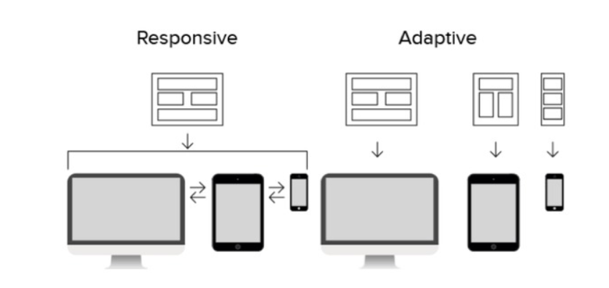
Responsive design (RWD) - was firstly put forward by Ethan Marcotte and applied when designing a webpage and changing the size of page in order to adapt to different resolutions screen via the CSS Media Query, Content (Based Breakpoint) and other technologies.
Adaptive design (AWD) - is about creating different pages in accordance with the specific size of a device. It will showcase corresponding page according to the screen resolution of the device. This will display different pages based on different screen resolution.
The Difference Between Responsive and Adaptive Design
This is mostly focused on the difference between responsive and adaptive layouts:
In short, the responsive design is somewhat like the liquid and will automatically adapt to the user's device regardless of the screen size. With the adoption of CSS media queries, this kind of design method can auto-change the display style on the basis of target device. This can well solve the display problems on different screen sizes.
However, the adaptive design is built on the use of static breakpoint, and the page won't be adaptive anymore once it's loaded. This will load the work layout appropriately with the screen size of device. In this way, you need to take all the mainstream display size into account and then design the corresponding layout. It will load and display the designed screen layout when a user visits a webpage. This can definitely make your website user-friendly.
Why and Where to Use Responsive Design & Adaptive Design?
Following are the advantages of both responsive and adaptive design:
The advantages of Responsive Design:
1. User-friendly and flexible on different screen resolutions.
2. Unified visual and operational experience on multi-terminal, with low cost spent on maintenance.
3. SEO friendly and there is no page version distinction, keeping the SEO strategy consistent.
4. The connection between mobile and desktop sites can be completed without redirection.
The concept of responsive design should cover the adaptive design with many commons existing at the meantime. Any website using the responsive design will adapt to the browsers of both web and mobile, and the site frame will automatically make appropriate adjustments after recognizing the screen width. Of course, the layout and display of the content may be subject to change.
The advantages of Adaptive Design:
1. Compatible even with some complicated site.
2. It can be implemented at a lower price.
3. Coding will be much time-efficient.
4. Testing will be much easier and operation can be relatively more accurate.
Theoretically, there is no big difference between responsive and adaptive web design, but the responsive layout is better than the adaptive layout in any case. Another thing is the adaptive design can make your design more manageable as you just need to consider few states. Practically, there are many responsive design problems while implementing, and the adaptive design can be easier implemented and test.
How Should They Serve for Our Design?
Having elaborating on the difference between responsive and adaptive design, we can realize that almost any kind of design idea has its own advantages and disadvantages. Being a designer, you need to keep current on the mobile or web design trends and meanwhile choose the proper solution according to the demands of the project.


Comments
Post a Comment