Top 8 Mobile Navigation Menu Design for Your Inspiration
The mobile navigation menu design is the most important bridge and platform for human-computer interaction that aims at guiding users in a right direction and not getting lost. There is a various type of menu bars available for choice now, but what kind of menu bar could be judged as an excellent design?
A good menu design can not only enhance the user experience of the entire product but also allow users to refreshing. So, I will share my understanding and experiences of the navigation menu in this article.
1. What’s the function of the navigation menu?
- To enhance the product content and function structure and hierarchy
Navigation is the skeleton of the APP, supporting the overall content and information, so that content in accordance with the information architecture organically combined, visually and clearly displayed in front of users so that fragmented content becomes full and orderly. Meanwhile, the structured arrangement at the same time also enhances the sense of ecology.
- Highlight the core functions
What the product lying to win the market are its core functions. Therefore, the core function must be put in a place where the users can catch it easily. And the proportion of the secondary function should be controlled to avoid distracting. Through the navigation, it can be a good highlight of the core, and appropriately hiding the secondary functions.
- Simplify the user journey
Reasonable navigation system and a smooth path to the task allow users to quickly achieve their goals and form a smooth user experience. The simplification of user journey has a direct effect on the user's viscosity and conversion rate of the product. So the high efficient navigation could guide users simply and directly to the app functions.
2. Types of the navigation menu
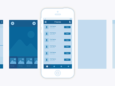
In order to understand the categories of the navigation menu after learning its basics, let me show you the details with the quick prototyping tool Mockplus.
1). Tabber - Classic navigation menu
Tabber is a navigation control which can be automatically generated in IOS and developed conveniently. So this kind of classic bottom navigation bar has been preferred by many app designers. This design matches with the one-handed operation habits of mobile phone users which helped most of the Apps in the market to get users.
Advantages: Clearly show the current location of the entrance; directly display of the most important entrance of the content information.
Disadvantages: If there are too many function entrances, the model seems unwieldy.
2). Rectangular, grid navigation menu
This grid navigation gets the main entrances together on the homepage, allowing users to make a choice. Such an organization doesn't allow users to see the content at the first time, which gives users much pressure to make a choice. There are now fewer and fewer applications using this navigation, which often presents in a graphical form as a table of contents on secondary page or aggregates as a series of tool entrances.
Advantages: This kind of navigation is simple but not rough, and the clear and obvious navigation could help to improve efficiency.
Disadvantages: You need to pay attention to color schemes. A design which is too fancy will let users feel visual fatigue.
3). Drawer navigation
Drawer sliding navigation is a good way to make up the defect of the switching limitations in Tabber navigation. This problem is solved by arranging the switching items vertically, hiding the menu on the current page. By one click, the entry button will be pulled out the menu like a drawer.
Advantages: It saves page display space and allows users to focus on the current page with a good scalability.
Disadvantages: It's not suitable for frequently switching applications.
4). Rudder navigation
This popular form of label navigation is often called as "rudder navigation," because it is styled like the rudder used to command the ship with other operating buttons on either side. When the page has most of the same hierarchy of content, but also requires a very important and frequent operation of the entrance, you can use this APP navigation mode.
Advantages: It can highlight most important entrances with the frequent operation.
Disadvantages: The same as the label navigation.
3. The classic navigation menu design
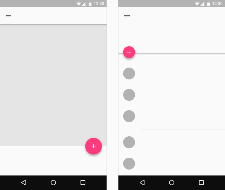
- Google's Material Design uses a "floating action button" to define this navigation. Which differentiates through the icon floating above the UI and has the appropriate dynamic effects, creating a new navigation guidelines.
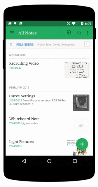
- Similarly, Evernote also draws lessons from this model, the user simply taps the lower right corner of the floating button, you can quickly record the current inspiration.
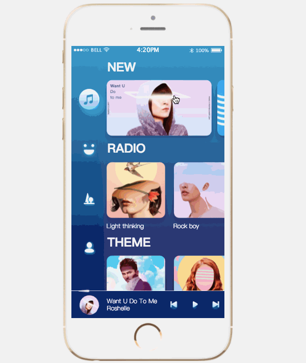
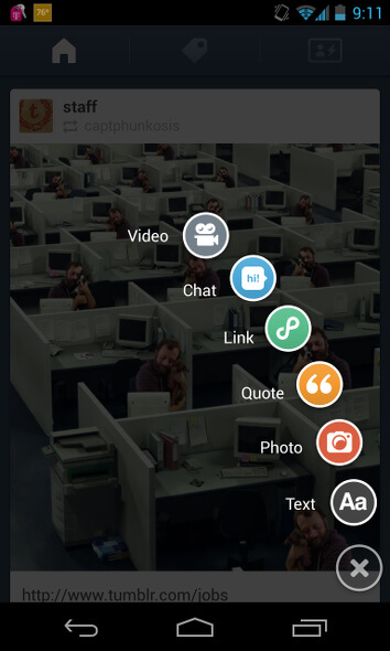
- Tumblr is equipped with the vivid icons and the appropriate labels. When you scroll down to browse content, these icons will naturally disappear.
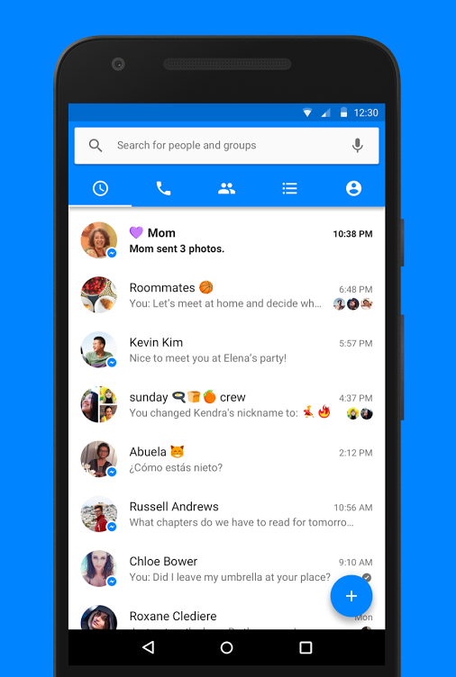
- Messenger's construction strictly follows the label navigation, with some labels fixed to the top and some clearly showing the main features at the bottom. The icons are clear and easy to understand, and they allow custom labeling, which resulting in a refined and neat visual experience.
Summary
More and more designers are aware of the importance of mobile navigation menu design for improving the user experience. In Android, we saw the navigation iteration from Hamburg to separate tab bar. In iOS, more and more apps are removing small tab bars and replacing them with bigger, clearer icons. In pursuit of a better user experience and simplified APP design, designers are constantly exploring new design directions along the path of optimization on navigation design.


Comments
Post a Comment