Horizontal Scroll in App Design, Why Is It Worthy of Attention?
However, every cloud has a silver lining. Though Horizontal Scrolling Lists does present more content on one page, problems concerning good user experience also arise, such as poor visibility, priority chaos, and mixed content. Therefore, when applying this interaction in App design, designers must be carefully prepared. Only then, you can make the most of this design and achieve good user experience finally.
Now, I’d like to share what I have encountered when I was using it. Hope it’s helpful to your design work.
1. Choose the right usage scenarion
The multi-dimensional information architecture of a single page is the most suitable application scenario for Horizontal Scrolling Lists. The traditional list is more suitable for the content that is infinite, of longitudinal presentation, and displays a single attribute (such as Moments of Wechat and Quora). As for the home page of an App, it may contain various information, so it requires scroll horizontally to extend more content.
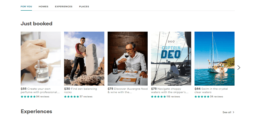
Taking the example of the latest version of Airbnb, the main page consists of plenty dimensions, including banner, popular experience, experience, housing, tourism destination selection, etc. In addition, each dimension separately occupies a single whole line to display the specific content. Also, by checking the iOS App Store, it divides the page into different dimensions to present different applications
Designers call this design in a vivid way as “swim lane”.
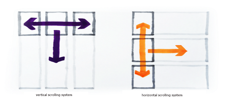
As you can see, the whole page of Airbnb and iOS App Store are based on “swim lane” with X and Y directions to display, it’s not difficult for users to browse. But when add Horizontal Scroll in the Y direction list, the occasion becomes more complicated. That’s where designers often make mistakes.
2. Appealing and appropriate themes
In accordance with the information priority, the "theme" of each lane is very important. In general, the area of each small horizontal card cannot be too large, so it is impossible to show the information as well as display the theme of the whole lane.
To deal with this problem, a strong visual information that is powerful enough to lead the entire lane is badly in demand. The most common practice is to set a prominent "headline" above the lane.
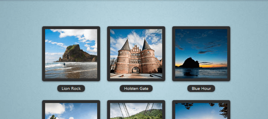
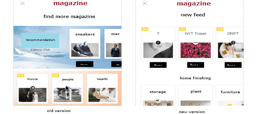
Recently, the more dramatic approach came into being. That is to add a strong content atmosphere directly to the left end of the lane. The following picture on the left side of the old version of a reading App, for example, designer combines text and picture to emphasize the theme, and it really does a good job on that aspect.
However, it also wastes many space to display content efficiently. Moreover, it violates the UI design principles of priority.
In order to make up for the deficiency, it changed into a small formulation with high visual priority in the latest version.
3. Guidance of Horizontal Scroll (Visibility)
There are a number of ways to guide, but the 3 most common ways include: first, add arrows to the left and right sides; second, add monitor on the bottom; third, preserve the follow-on content.
Anyway, whatever you choose, make sure you provide a clear sign to inform the user that the following content can slide horizontally. Especially when you won a big market among users (like general electronic companies and newspaper reading), for your elderly users, lacking knowledge about interaction design, they may not as familiar with it as those designers or product managers. As a result, it may decrease the efficiency of this interaction.
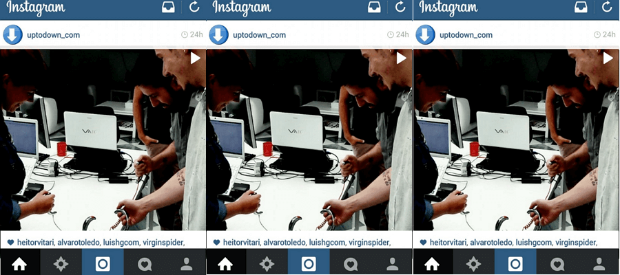
Put a negative example, Instagram recently adds the feature to allow users slide several pictures at a time. But the indicator at the bottom is merely invisible compared to the stunning pictures, thus resulting in vain user experience and interaction design.
4. Control quantity and avoid limiting cases
Can we apply horizontal scroll in App design infinitely on a single page? The answer is definitely no. Considering my own experience, the average 5 to 10 cards is better. Less than 5 may fail to meet users’ expectation for the discrepancy of necessary information, while above 10 may limit users to go deep into each theme and explore more details.
A serious note: if you are unable to control the number of the cards on a theme, you’d better design a backup plan.
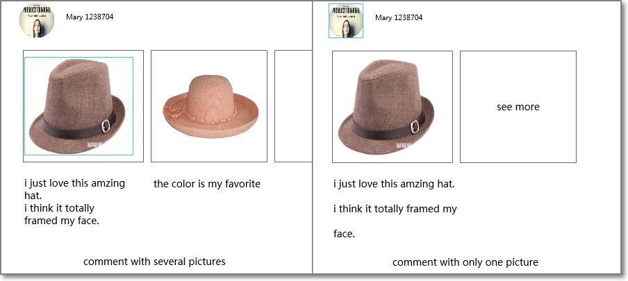
Take the example of Koala overseas online shopping, users’ comments module with pictures will be displayed through horizontal scrolling lists, but the designer cannot keep the number in check strictly. Some items are commented with several pictures, while some may have only one or even none.
We notice that Koala adopted different tips of the design process to fit in different contents. But for those with only one picture, it can be really awkward if there follow with a “see all” on the right.
Speaking of “see all”, it’s usually required to appear in swim lane. When display, you can just click the title directly or there is an entry guide following the title. On most occasion, however, it only appears until you slide to the last card, which provides a way out for those who wants to explore more.
5. Low productivity and false priorities
Designers prefer horizontal scroll design for it holds a great density of information. Moreover, the logical behind each page is more reasonable. Also, it’s really cool to do it. But for designers with rich experience, on the contrary, they tend to avoid this interaction, because of the low productivity, which focuses on the following two aspects:
First, as I mentioned before, many users used to the traditional way of interaction with vertical sliders, and they are reluctant to scroll horizontally, which they are not familiar with either.
From my experience and the communications with my friends, both the usage and click rate of horizontal scroll module is lower than the traditional ones. Even only several cards, few users will slide to the last one.Therefore, for those used to slide along a regular direction, it’s not easy to change their habit by adding a totally different direction to browse.
Second, false priorities about horizontal and vertical scroll may result in expectation errors. The following App Store, for example, all contents you see are Apps. They are just be organized by different dimensions.
Then there comes another question: should we give priority to the New Apps we love or to What We're Playing Today?
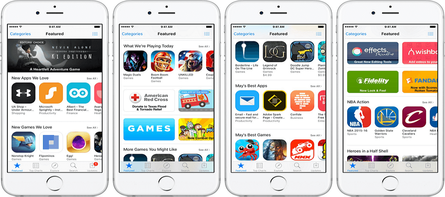
If you want to buy one of the resource-niche, will you choose the high priority lane on the second page, or the lower priority lane but on the first page?
The answer is clear that what you see on the first page gains higher priority, and so with the rates of hits and exposure. But in reality, this is not what designers and product managers expected, they only focus on putting the high-priority Apps on the top, but neglect the low click rate.
Meanwhile, more Apps quit using the horizontal scroll, instead, they display contents directly.
To sum up, hope the above information I gained through my own work experience can be helpful. By the way, I’d like to suggest you a demo that displays picture carousel. Thanks for reading.
Also read:


Comments
Post a Comment