For UI/UX Designers - What Does UX Mean in Web Design?
What does UX mean in web design? It means that website is designed to make the interaction between user and product as easy and comfortable as possible.
Therefore, UX serves not only for itself. Properly applied UX can attract visitors to your site, increase their retention time, and thus improve the conversion rate. The meaning of UX in web design is obvious, and knowing what’s meaning of UX in website design matters a lot.
Here are 5 reasons explaining “what does UX mean in web design”:

1.) It helps users achieve their goals
Although many companies don’t want to admit it - users don’t read every word on a website carefully and attentively. Instead, users come to the page with a specific purpose, such as:
- ● Look for needed information.
- ● Inquiry and buy a product.
- ● Make a booking like flight.
- ● Watch a specific video
The simpler you make the visitor achieve his or her goal, the more leads you will generate from customers.
Nowadays, users decide within 8 seconds if they want to stay on a site or leave it. In these 8 seconds you have to make your offer, customer benefits and further steps clearly displayed to your visitors.
A clear user guidance is the key. With a useful value proposition, you can immediately integrate what you offer with what the customers need.. A well designed navigation menu makes it easy for the visitor to move to your side. Rapid prototyping tool like Mockplus can allow you to quickly create a well-made interface and clear user guidance. And logical links lead him directly to his most probable goal - and thus also to conversion.
2.) Well-written texts also matter
Writing good texts is such a tough task, while writing good web texts is twice as difficult as it. Many companies design their written content like the articles on a specialist magazine: correct in content, packed with technical terms - but difficult to read.
The offer is usually in the foreground. And other things like the product features and its user experience may not the visitors’ focus. As a result, the coming visitors would skip most part of the page texts as they are too long to go through.
In short, well-written texts have much in common. The most important thing is that they are handy, easy to understand and focused on the user, according to principles of usability.
Not only can well-written text deliver your company message to customers in a better way, but also increase the conversion.

3.) User-friendly typography improves your texts
The content of a text is one thing, its form is a completely different matter. A handy and reader-focused spelling doesn’t yet make a text legible.
Details such as color, font size, or line spacing also have a large effect on readability. The form of the texts is a important factor that you should not ignore. This also covers UX design. The readability of texts is an important part of usability. Finally, illegible writing can easily ruin the good impression left on users.
To optimize user experience of your website, you should also ensure the quality and legibility of your texts.
4.) Thoughtful buttons make site better
Buttons, that may be inconspicuous, are an essential part of the conversion optimization. They offer services, redirect visitors to a landing page, and confirm the conversion process. It is obvious that attractive and easy to understand buttons will increase your conversion rate.
So here we’re getting again back to UX design again when it comes to button design, which is an art itself. There is much to note:
- ● Shape
- ● Size
- ● Color
- ● Text
- ● Positioning
- ● Picture (Yes / No)
A button must attract the attention of visitors, but must not be too distracting. It must contain a clear and comprehensible action request, along with consice text meanwhile. And, of course, it has to fit into the website naturally so that users click on it intuitively.
In short: If you want to design effective buttons, there is no alternative to UX design.
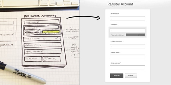
5.) Comprehensible forms is better than cryptic

A form is the last hurdle between a “visitor” and a “customer” - a hurdle that you should not underestimate.
It takes efforts for users to complete a form. The effort may be reduced by a newsletter form. But anyone who has already booked a flight online or submitted an application on a career portal knows the extent to which a form can be accepted.
It’s no wonder the form that includes the superfluous queries inaccurate labels and cryptic error messages can make users confused and skeptical.
Therefore, be sure to bear your users in mind when designing a web form. If you run it with clear instructions through individual steps, it also increases the probability of form submitting. If you ignore usability, then your form looks more like a barrier. Hereto we have already answered the question “what does UX mean in web design?”.
UX Design also helps the provider
After discussing “what does UX mean in web design?” we can see, user experience design pays off not only for users, but also for vendors. You attract more visitors to your website, increase the conversion rate, and generate more leads for your sales.
Read more:
Comments
Post a Comment