20 of the Best Website Homepage Design Examples
You never get a second chance to make a first impression - that's why the first screen of your homepage undoubtedly plays an important role in your website. Flat design is one of the most popular design trends today. In many ways, it is design stripped down to the basics and focused purely on the raw functionality. It gets rid of unnecessary graphical and animated elements, which requires you being good at the interplay of icons, typography, and color. Below, we have put together a list of 20 amazing website homepage design examples for designing an impressive homepage that will hopefully inspire your next project.
The typography on this website is very practical and frequently-used. It is simple, yet powerful. The bold typography is the best suited homepage style for simple and clean layout.

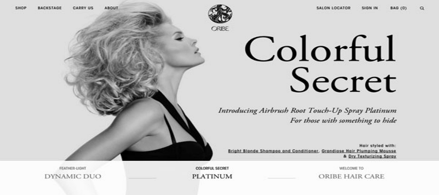
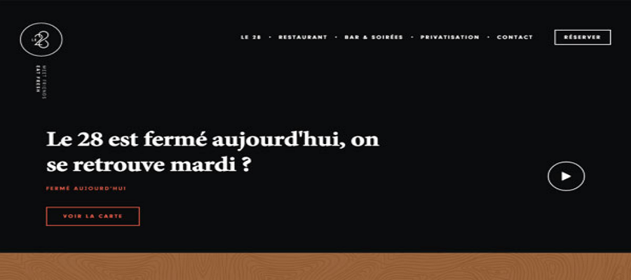
Text centered and filled the screen.
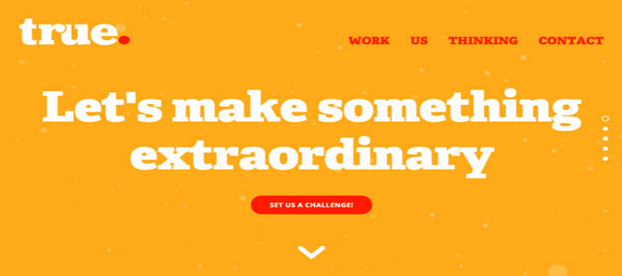
The font design is elegant. What's particularly great about Aaa is that it will show different background when hovering the mouse pointer over the navigation bar.
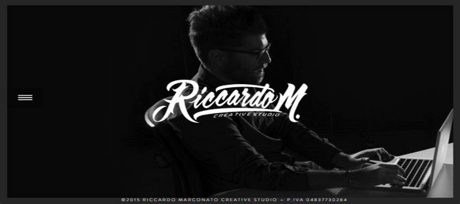
If the text is very short, expand the character spacing and line spacing.

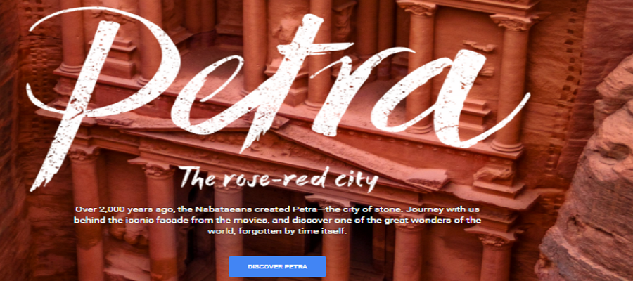
This website is highly interactive with cool animation.
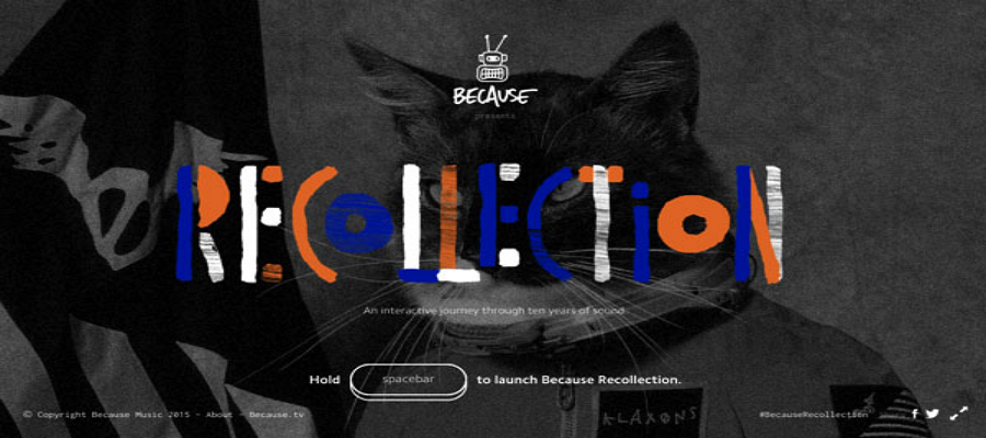
It is a very clean and simple design.

Dig deeper into this website and you will find it’s brilliant, especially on minor details.
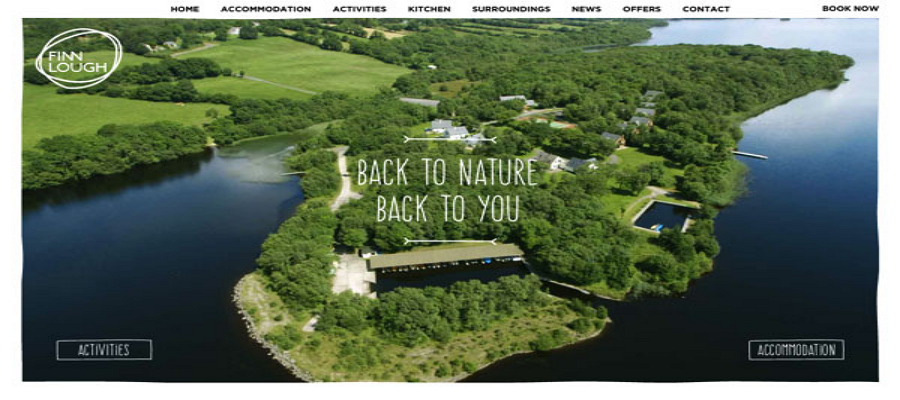
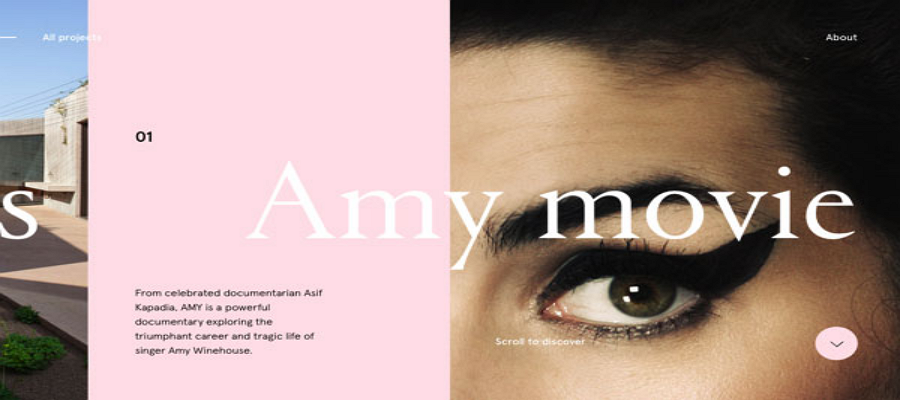
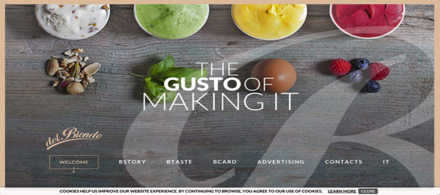


An interesting horizontal scroll website

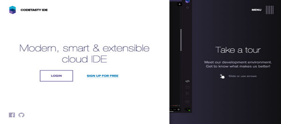


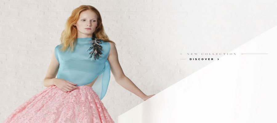
The bold blank of the website on the right and left side makes the vistors feel comfortable and fresh.

Conclusion:
The great homepage design not only pleasure the users, but also improve the site user experience and attract more users. Above are some of the best website design examples selected by the Mockplus team. Hope that can provide you inspirations and help you achieve a better design.
You may also interested in:
Comments
Post a Comment