Flowchart Design - How to Make a Good Flowchart in 3 Steps?
Flowchart design is familiar to a majority of people, which makes versatile explaining and presenting of the process and also offers a fresh view which distinguishes it from black and white flowcharts on the paper. This kind of design approach is getting popular in recent years, but it’s not easy to explain “what is a flowchart design”. Perhaps those words of “user experience”, “interaction design” or “page structure” may come to your mind this moment, but that’s all? The answer is absolutely not.
What Is a Flowchart Design?
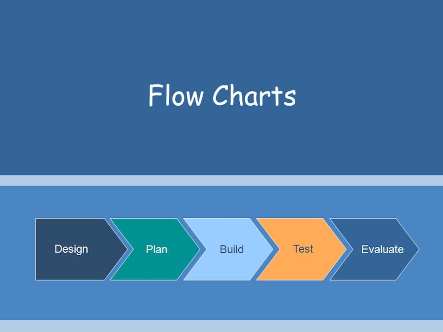
In a plain word, the flowchart design is a type of diagram representing a workflow, process or algorithm. It’s a combo of Start, End, Action, State and Judge. Based on different project and the given goal, there are generally four types of flowchart design, including Product Flowchart, Business Flowchart, Operation Flowchart as well as UI Flowchart. Obviously, the UI flowchart can be used as a starting point for design planning and acts as an indispensable role in the product design. Following I will walk you through more details.
The Importance of UI Flowchart/Flow Design
As its name implies, the UI flowchart/flow is used to describe the logical relationship between pages, with many benefits included. For designers and product manager, it’s the basis for refining the workload and discovering the potential issues behind the product. The flowchart enables them to focus on the user goals, and the cost of making changes will be pretty low.
Also, this kind of flowchart is more acceptable for developers and acts as an important reference for assessing the workload, carrying out the coding work as well as presenting the logic between pages. How to make a well-built one on earth? Below are some flowchart design tips for your reference.
How to Make a UI Flowchart Design?
In general, there are 3 main steps to make a good UI flow design:
Step 1 – Verify the Design Ideas and Priority
As the going says that “a good start is half the battle”, the UI flow design also needs preparations in advance. It really matters that how your design ideas will look like and users will interact with your product. The analysis can be integrated with:
User group - a set of people who have similar interests, goals, or concerns.
User value - the utility of consuming a good and it's most often expressed as a money-price.
User experience - the overall experience of a person using a product, especially in terms of how pleasing or easy it is to use.
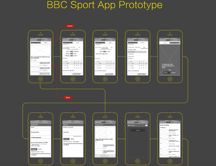
Also, you need to predict the user operation in order to optimize the design process. Here, we need to figure out what we need to do and consider the behaviors of our audiences. Here is an UI flowchart example from designer Anny Zhang on Behance:
Step 2 – Start from the First Initial Page
Having settled down the product functions and goals, we need to assign the content to individual page now. There will be connections, buttons, forms and many other elements which will be triggered by users so as to jump to other pages. Also, the page will be connected by the lines with different properties and state.
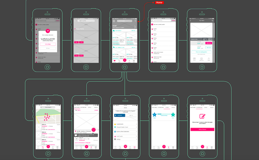
This may sound abstract and complicated, but the best way is to draw a flowchart from the initial page. There’s no need to be entangled in the user behaviors, instead we need to assume how the user will interact with the product in every possible scenario. Here is an example of Gogobot which starts from the initial page:
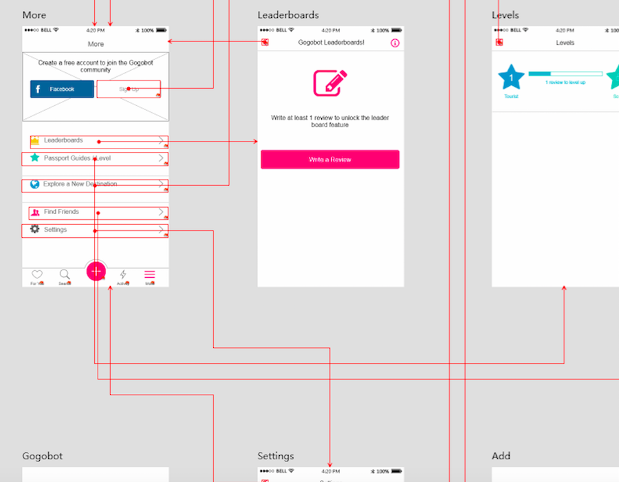
No matter you are an expert who can make amazing UI flow design by PowerPoint or Microsoft Office, or just a newbie who has limited design knowledge, a useful tool can improve your design efficiency and level. The above examples are made with a rapid prototyping tool named Mockplus, with its built-in “UI Flow” feature which supports:
1. Instant switching between design modes.
2. Displaying the UI flow of all or any number of pages
3. Displaying important page markups and exporting at once.
4. Generating connections between pages which can be manually adjusted.
Step 3 – Make Adjustments on Page Structure and Content
Once completed, we still need to have internal discussion and make adjustments on basis of that. Besides the page logics and interactions, whether the structure of page is reasonable also matters.
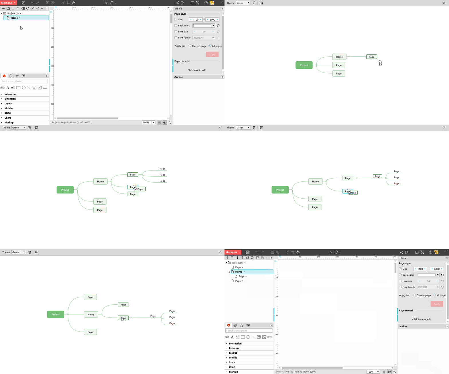
A cool thing is Mockplus offers the MindMap feature which enables any of us to lay out the pages in a project intuitively and export the MindMap as an image with just one click for the later PRD documents. Learn more cool new features of Mockplus.
Wrap Up
Applying the above 3 steps will help you make a good flowchart design, but always remember to make your flowchart diagram easy-to-understand. This can be given the highest priority. Besides, a good tool like Mockplus that has powerful flowchart drawing feature will save you much headaches and efforts in the design process.
Comments
Post a Comment