How To Use Color In UI Design Wisely to Create A Perfect UI Interface?
Whenever found an interface that looks nice, clean and elegant, I save it. Now I have a collection of more than 100 UI interfaces. After learning, making use of or simply viewing it again and again, I finally realized something in common. It is always the color that steals my heart at the very first look. So here, I’d like to make a conclusion about how to use color in UI design wisely. A serious note first, what I wrote can’t turn you into an excellent UI designer magically, but I promise you’ll learn something here. If this is actually useful, please leave me a comment.
1. The magic power of color
Color can speak, as powerful as language. You just can’t argue me about that. Think back whenever you encounter a site or a product, it is the visual appearance, which largely depends on color, that always leaves you the very first impression.
So, what color can do actually?
1) Reflect the personality ofa brand
Color can set the basic tone,mood, connotation and conception of a brand or a product. A research made by CCICOLOR says that users only take 90 seconds to estimate products online, and between 62% and 90% of the judgment of their initial view is upon the colorscheme.
2) Achieve better user experience
The right choice of color can support better readability of the information. Beside, it can increase usability sharply, such as strengthencall-to-actions, enhance navigation, stimulate intuitive interactions, satisfy aesthetic needs and visual solutions. In all, to create clear and harmonious style that meets users’ needs.
3) Influence the purchasing decision
According to Kissmetrics, the visual appearance of a product is the key factor influencing consumers’ purchasing decisions. Also, research from QuickSprout indicates that 90% of all product assessments have to do with color. Nowadays, many companies take Colors, especially color in UI design, as one of their marketing strategy.
2. Fundamental concepts about colors
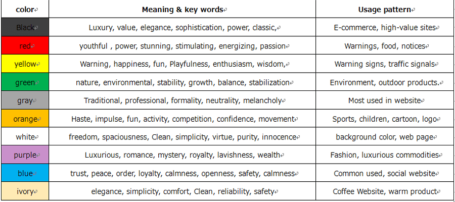
Each color hasformed its unique meaning and connotation in the long run of human life. Read the meaning of each language, please have a look here.
3. Tricks to use color wisely
1) Choose the right color in the right usage pattern
We can’t say a color is “bad-looking”, only you use it wrong, then it may look bad. Imagine this, if Mcdonald’s uses gray and black instead of yellow and red, you still have a hungry appetite? Women wear black dress and red lipstick at party, why?
It looks sexy and charming, that’s it.
Different color conveys different meanings and senses. Use it wisely means hit the 5 “rights”: choose the right color, at the right time, in a right usage pattern, with the right users, and target the right goals.
If you want to use color in UI design wisely, please pay attention to the above chart, I am serious. Unless you would like to take a big risk to be unique.

2) Pay attention to BLUE
Why talking about blue?
Just have a look at your most commonly used Apps or sites, Facebook, Twitter, Microsoft, Safari, etc. What's in there? Yes, you’ll see, they are all in blue. Various kinds of blue.
According the research, blue is the NO.1 color that women and men both like. Blue is like everywhere, in nature, in sites, in clothes, etc. and as I enter the words, I see the interface of Microsoft Word is in blue.
Blue is definitely a safe color that can cultivate user’s trust and be accepted, blue is a typical example of color in UI design. If you have no better choice, just use blue.

3) Color variations between the background and the elements
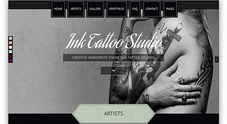
Have a look at the following interface:
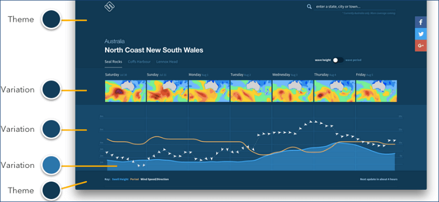
Regardless of it’s blue again, let’s focus on the variations. The theme color is Blue, and the other elements are darker color variations and brighter color variations. But in all, they look good, harmonious and work with each other.
How to do it?
Just one simple golden rule:
“ Darker color variations are made by lowering brightness and increasing saturation. Brighter color variations are made by increasing brightness and lowering saturation.”
This is echoing what others have said, you can check this excellent observation at the source.
4) Golden ratio in color proportion - The Golden (6:3:1) Rule
You can’t walk away from color combinations completely when doing UI interface design. To combine color in UI design is easy, but how to avoid chaos and overload? how to get rid of plain and stay on sophistication?
Remember in mind the 2 principles:
The first is: 6:3: 1 rule
The 60% + 30% + 10% principle is the best proportion to reach balance among colors. This criterion can work perfectly by cultivating a balance, neat, harmonious interface that brings pleasure to the users. Also, it can ease users' eye to move comfortably from one point to the next.
The second: max 3 primary colors
This rules match with the The Golden (6:3:1) Rule. It’s also a good way to avoid chaos and keep in balance in your color scheme.
5) Color combinations and Complement: clean and eye-friendly
What matters when delivering a harmonious color scheme? There are several factor need to consider:
First, Tints, Shades, and Tones
based on a "hue", you can create many changing variations on the color wheel. There is a trick: adding white then you can get a hint, black for a shade, and grey for a tone. And here, i suggest use single color scheme.
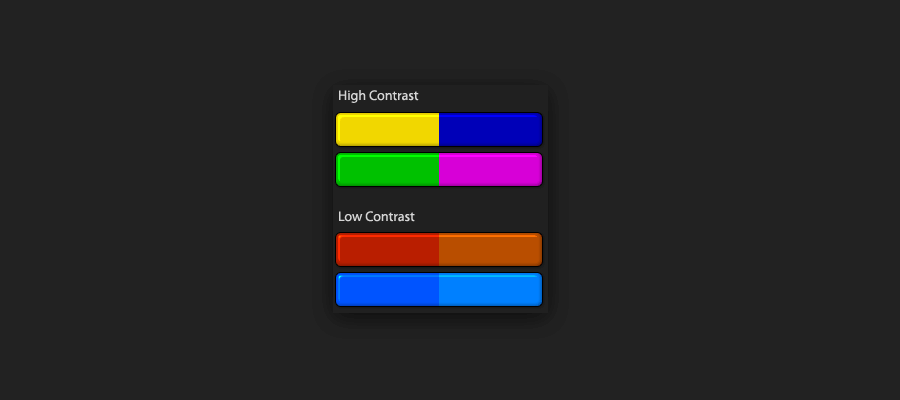
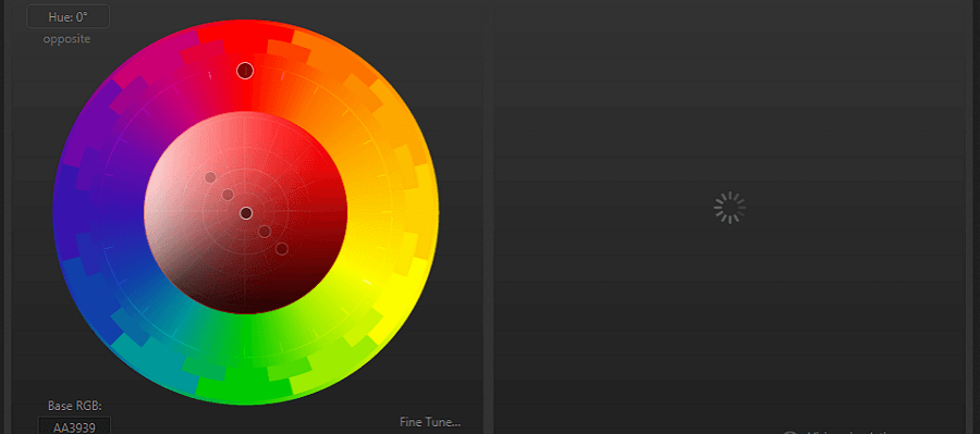
Second, Contrast
Color contrast is also a practical method of color in UI design. Contrast can evoke various emotional response from users. Colors on opposite sides of the color wheel can generate the strongest contrast, like black and white. Strong contrast can draw users' concentration and tension; while light contrast can bring comfort and please by displaying a relaxing and casual design.
Be careful not to pile it on, or you are causing troubles and confusions to the user.
6) Black, white and elegant
Black is the strongest of all the neutral colors, while white is the most used background color. As mentioned above, those two are the greatest level of color contrast. Adopt black with white properly, you can create a UI interface that looking elegant. This color scheme is mostly used in website. Black can give a feeling of sophistication, and white space can create a sense of freedom and imagination.
7) Get inspiration from nature and art
Nature and art are the main resources of color inspiration. Just go outside, look at the sky, you'll see the most various and natural blue. Color in nature is the best choice to create a feeling of user-friendly and natural. To extract color from nature can ease users' eye and bring them the magic power of beauty. While art is the direct reflection of nature, so just make the most of it.

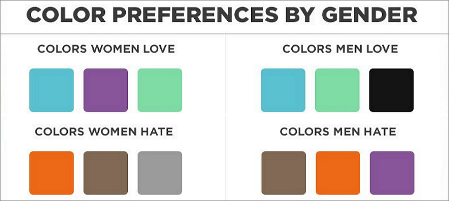
8) Color knows about gender
It’s like born this way, women don’t like gray, orange, and brown. They like blue, purple, and green, while men don’t like orange, purple and brown. Men like blue, green, and black. It's definitely a disaster if you doing a sporting design in purple. Just remember, whenever you are targeting to men, choose the color that convey maleness. Similarly, use female color to do the design that mainly used by ladies.
And one more, pink is not the universally-loved female color!
4. Tools and templates
Tools and anything that can be useful can make things much easier. Here i picked some of the best UI design tools for choosing color palettes. They can be a big time saver when adopt color in UI design.
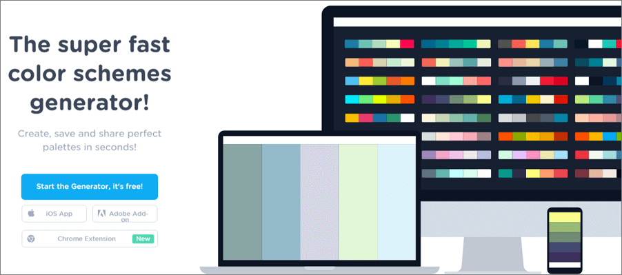
1) Coolors.co
Coolors.co is a professional color picker. It allows you to lock your selected color and press space to generate palette. You can also upload images and then make a color palette from it. Coolors.co also provides you a picker to modify reference point.
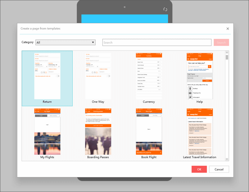
2) Mockplus
Mockplus is a smart tool to do UI interface design. You can import directly all kinds of sample projects and templates with nice layouts and interfaces. The coolest thing is that you can use the common functional page templates to quickly build some specific pages including homepage, sign in/up page, setting page, help/about page, search page, etc. Also, the color picker inside and various properties allows you create ideal UI elements.
3) Paletton
Paletton is a good tool for to pick color. It’s kinda similar to Kuler but the good thing is that you are available to more than 5 tones. This tool is especially useful when you have picked your primary colors and want to generate extra tones.
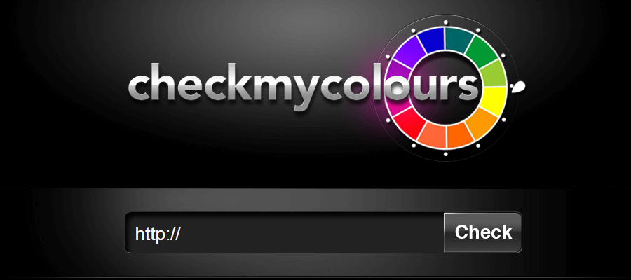
4) Check my Color
It is a tool for checking foreground and background color combinations of all DOM elements and determining if they provide sufficient contrast when viewed by someone having color deficits.
A note: Do remember the usability is everything
To use color in UI design wisely can create a gorgeous UI interface, but creating gorgeous UI interfaces is never the final destination. To achieve the excellent user experience goal that can make users’ life happier is the key. So, in perspective of color choices and usage in UI, designer should always remember that the interface should be highly usable and clear. What can do and what can’t in user-centered should always carry weight.
You may also interested in:


awesome post..
ReplyDeletegood post. I just read your blog and wanted to say that I have really enjoyed reading your blog posts.Keep update with your blogs..
ReplyDeletebest website designers in hyderabad
website designers in ameerpet Hyderabad
web designers in hyderabad telangana
Its very informative blog and useful article thank you for sharing with us , keep posting learn UI Design Course
ReplyDelete