Rapid Prototyping for UX/UI Design: 5 Steps for Fixing Flaws… Fast!
It’s been a long, hard struggle over almost three decades, but the tech world is finally starting to recognize just how much power and influence UX and UI design have on the bottom line. According to the Forrester Research study cited by the Forbes article…
- Optimizing a user interface (UI) improves conversion rates up to 200%.
- Optimizing the user experience (UX) improves conversion rates up to 400%.
These statistics may seem surprising or even unbelievable at first, but they make sense when you stop to think about it. The better the UX and more intuitive the UI, the more comfortable the user feels with the brand.

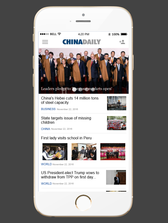
Mockplus sample project for China Daily
The problem is how abstract UI and UX design can be. No two users are the same, so how can a designer predict behavior that’s essentially unpredictable? That’s where rapid prototyping comes in — a methodology that combines the thoroughness and dependability of trial-and-error research with the speed and efficiency necessary to survive in today’s digital market.
Rapid prototyping in digital design dates back to the early 1990s, although its conceptual roots go as far back as the 60s, even further if you include wind tunnel testing on airplane models at the turn of the century. However, today’s digital design is almost unrecognizable to what it was in the 90s. Even since Smashing Magazine’s seminal article on rapid prototyping in 2010, the process has evolved in leaps and bounds during the last seven years.
Our goal with this article is to present the most up-to-date rapid prototyping process. If you’re a beginner to UX and UI design and you’ve heard the phrase “rapid prototyping” thrown around without knowing what it is, this article will clear everything up. If you’re an experienced designer who wants to stay current on rapid prototyping practices, this article will help you keep your edge sharp.
Below, we outline the best method for rapid prototyping in just 5 steps:
1. Define the Goals of Your Prototype
There are different kinds of digital prototypes, made in different ways to suit different purposes. Your initial step in the rapid prototyping process is first deciding what your goals are so you know what kind of prototype to build, and later what to do with it.
Among others, your prototype’s fidelity changes based on the need. Some conditions allow a low-fidelity prototype, something akin to an interactive wireframe, for a much faster turnaround. Other reasons, such as eliciting investment funds, necessitate a higher-fidelity, pixel-perfect design to mimic the final appearance.

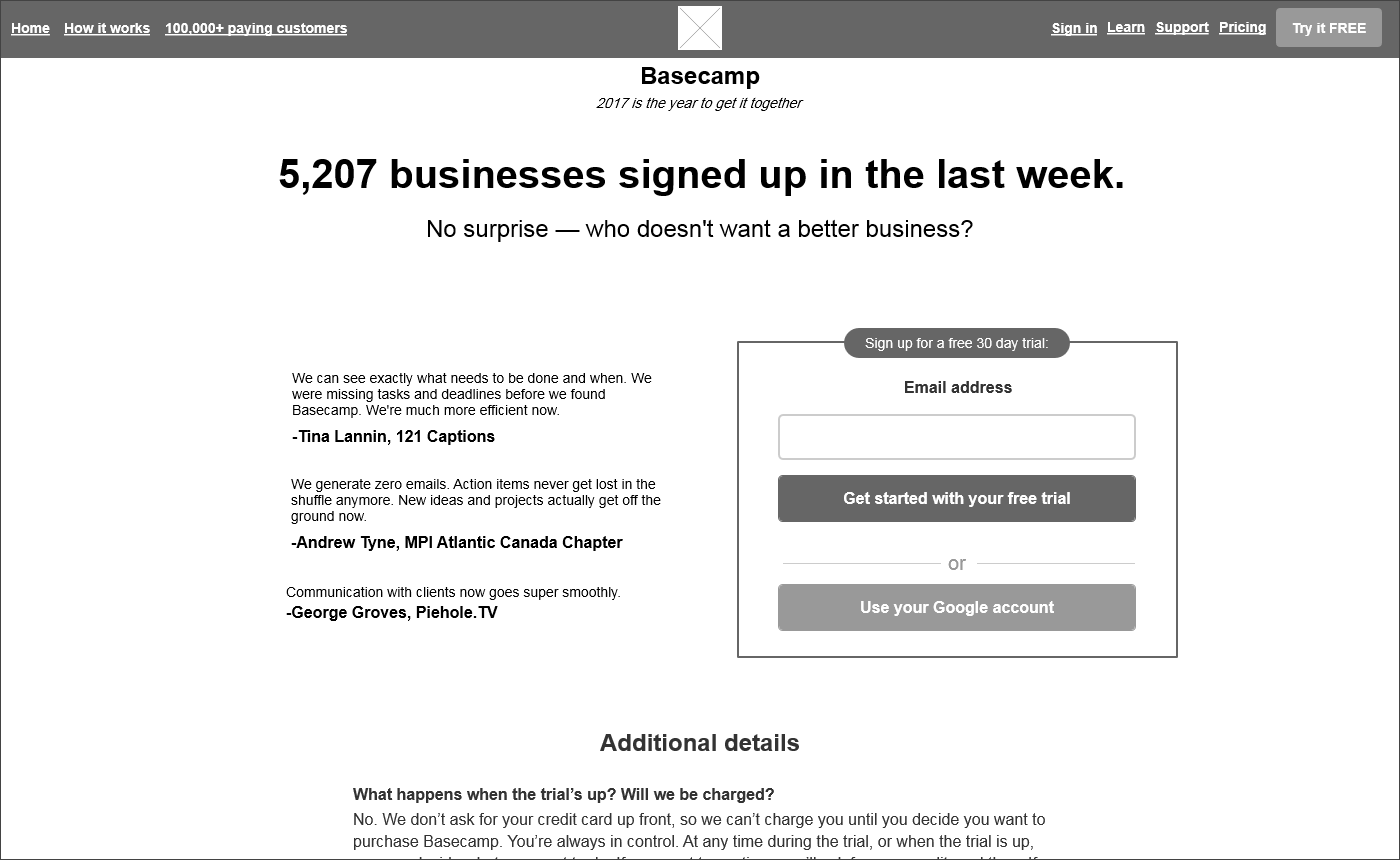
A low-fidelity prototype for Basecamp testing a call to action
Here are a few of the common purposes for prototypes, and the special considerations that go with them:
- Specific User Problems. You’ve already isolated a problem in your UX or UI design, and you’re testing different methods for solving it. For the sake of speed, you can keep your prototype fidelity low and build out only the areas and pages relevant to the problem.
- General Diagnostic Testing. You’re not sure what’s wrong with your UX or UI, and want to test the whole design to make sure. The more of the design you include in the build, the better. However, you don’t want to waste time perfecting everything because test results may require you to delete some parts. Low-to-mid fidelity works fine for testing the usability, and later you can test again with a higher fidelity to master the visuals.
- Stakeholder Buy-in. You want to demonstrate your proof-of-concept or a new proposal to stakeholders. Stakeholders respond to visuals, so a high-fidelity, pixel-perfect prototype or mockup is more effective.
- Sales/Account Management. Similar to stakeholder prototypes, these are used to explain plans and gauge reactions from your key clients and prospective clients. Again, high-fidelity prototypes or mockups have more impact.
This early stage is also a good opportunity to collect feedback from your team-members. The best ideas can come from the most unlikely places, so gather feedback from all across the team before building your first prototype. Rapid prototyping is all about experimentation, and because it’s “rapid,” you can test multiple concepts without too much risk.
Once you know the purpose of your prototype and have some ideas on how to build it, it’s time to roll up your sleeves and get started on making the actual prototype.
2. Build a Quick Prototype
One of the factors that has changed the most since 90s digital design is the availability of better design tools. Prototyping software today — like Mockplus — handles most of the technical details and coding so that designers can focus all their attention on interaction design and the user experience.
In fact, modern prototyping software makes rapid prototyping more efficient. The drag-and-drop usability and preset library of design patterns allow designers to create new, original prototypes faster than ever. Churning out prototypes quickly is a key part of rapid prototyping; after all, it’s in the name.

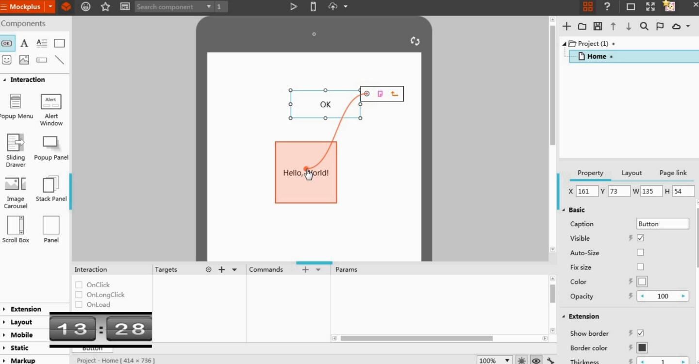
Drag-and-drop functionality in Mockplus
So first, you want to make sure you have the best prototyping software for your design style. From there, you build the prototype within the parameters of its goals.
As we said above, you want to choose the right fidelity for your prototype’s goal. To test usability, a lower fidelity works better because it takes less time to build and rebuild. However, for inspiring confidence in stakeholders, executives, or key clients, higher fidelity works better: it’s more impressive visually and the time it takes to build is less significant since you only need to make one or two iterations.
Remember that perfecting the graphics takes time, so you only want to use high fidelity on elements you already know will make it to the final version. If you make your early prototypes in high fidelity, testing will reveal that certain aspects need to change, and therefore the time you spent perfecting those graphics is wasted. It’s best to test first in lower fidelities and only perfect the visuals on elements that “pass the test.”
If you’re having trouble pinpointing how simple or complex to make your prototype, consider these areas:
- Scope. How many pages or screens does your prototype need. If you’re testing an isolated aspect — i.e., the best call-to-action button on your homepage — then you only need to include the relevant pages. However, if you’re doing a general diagnostic test or proof of concept, you want as much of the entire product as possible.
- Interaction. Testing usability certainly requires interaction, even the minute details like hover text. However, if your goal is a demonstration or visual aid, you can get by with a static but high-fidelity mockup.
- Importance of Visuals. Low-fidelity interactive wireframes are acceptable when testing usability, but potential investors, stakeholders, and clients prefer high-fidelity so they can better envision the final product.
One of the most common questions about prototype design is whether to use lorem ipsum or real content. We recommend avoiding lorem ipsum; prototypes are supposed to look and feel like the final versions, including content and text.
True, lorem ipsum saves time and works as a placeholder, plus you don’t want to waste time writing copy that eventually gets thrown out in the later stages. However, lorem ipsum harms usability because it’s essentially nonsense — it’s better to use placeholder text that closely resembles the final version. Simple placeholder text is a good compromise: it’s closer to the final version than lorem ipsum for more accurate results, but you don’t spent a lot of time perfecting it in case you ultimately need to remove it.
3. Test with Actual Users
Why is rapid prototyping so effective? Because it allows designers to collect empirical usability data from actual users quickly and at regular intervals of the design process. If your goals are about improving your UX/UI design, user testing is the most important step in the rapid prototyping process.
The problem with UX and UI design, as we mentioned before, is that it’s abstract with a lot of guesswork. User testing, however, replaces guesswork with cold hard facts. The more testing you do, the more data you have to influence your design... Hence the need for a prototyping method that encourages faster iterations for more frequent testing.
Just like in the previous step, choosing the right prototyping software from the onset can make user testing a lot easier. We can’t speak for other prototyping software, but to give you a frame of reference, our Mockplus offers 8 different ways to test your prototypes, including offline HTML5, exportable demo packages, and QR scanning for mobile devices.

Informal but effective user test. (Source)
Conducting the actual user tests is an art all its own. Finding the right test-takers, organizing the best environment, writing test scenarios, and even administering the test all require their own best practices. While we don’t have time to get into all that now, read our previous article How to Conduct Usability Testing Quickly & Easily for a complete treatment on the topic. This post explains step by step everything you need to know to maximize the results of any user test.
4. Use Feedback to Refine Your Prototype
How did your user testing go? No matter whether they loved or hated your designs, as long as you collected some data, the test was a success. Even if all your design choices turned out to be failures, at least now you know they’re failures and can implement different strategies going forward.
And that’s exactly what this step of the process is about: implementing what you learned from the testing in the next iteration. Given the current state of prototyping software, you can edit problems with your design in just a few clicks, or even drag and drop a new element to replace an old one.
How good your next iteration is depends on the quality of the feedback you got from your previous testing. Targeted and insightful feedback will tell you exactly what needs to change and how, although users are not always so articulate and you may need to read between the lines or conduct more research. Sometimes all you know is that this version doesn’t work, and you have to start from scratch brainstorming new ideas.
Luckily, every time you prototype, test, and refine, you become one step closer to a perfect product. Which brings us to the final (or not-so-final) step in the process...
5. Repeat Until Perfect!
What makes rapid prototyping better than more traditional methods? It lets you test new prototypes more often, over and over, until the design is perfect. The alternative is sinking time into polishing elements that may ultimately be discarded. Rapid prototyping puts the emphasis on usability and user preferences first — it’s a design methodology that prioritizes the user’s opinions over the designer’s.
In order for rapid prototyping to be effective, the process needs two characteristics:
- Progressive iterations
- Rapid turnaround
The first, progressive iterations, should come naturally if you follow the steps above. As long as you don’t design erratically and be sure to implement the feedback from the previous round, each new iteration of your prototype will be better than the one before it.
The second characteristic, rapid turnaround, is worth discussing in more depth
One of the common pitfalls for designers new to rapid prototyping is that they get caught up in the details. By its nature, rapid prototyping is more effective when it’s fast. Don’t get too attached to ideas early on, and don’t fret is there’s a “hair out of place” in early prototypes.
It’s called “rapid prototyping,” not “perfect prototyping.” Designers don’t want to get hung up on mastering every single detail before testing — in fact, that hinders results by making the process take longer. Reiterating designs for retesting should be done as quickly as possible so that you can pack more tests (and more user data) into the same time frame.
That’s not to say your prototypes should be sloppy! You always want them to be as close to the final productas possible. The key is to build a prototype with enough quality to generate accurate results — a prototyping that looks and feels like a finished product — but that doesn’t take too much time.

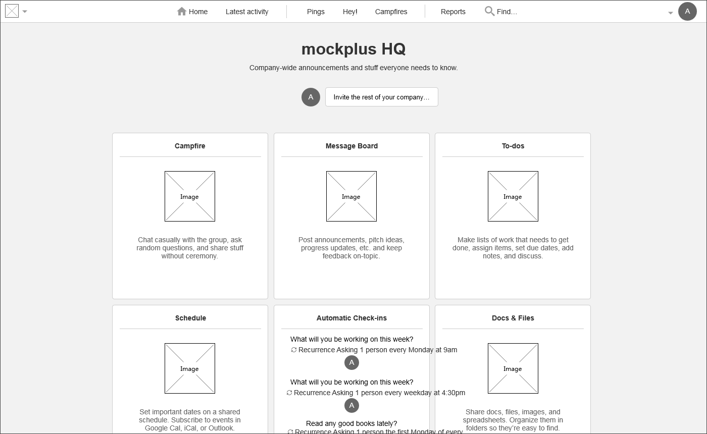
Mockplus sample project for Basecamp remains low fidelity until the elements are proven through testing
Assume every element you design could be deleted later until you have the data to prove its worth keeping. Only then should you spend time finalizing it. You don't want to invest a bunch of time designing a single element that just ends up being thrown out in the next round.
With that in mind, make sure your prototypes excel in all the necessary areas: they meet the visual requirements of their goal, and all the relevant areas being tested are as close to the final product as possible. Above all, rapid prototyping should be rapid, so curb your perfectionist instincts until after you’ve collected sufficient usability data.
Takeaway
What do the best user experience designs and user interface designs have in common? The user.
UX and UI designs are user-centric, meaning they should be hand-tailored to suit the specific needs of your unique users. The best methods for achieving this — until we develop mind-reading technology — is trial-and-error testing, which makes rapid prototyping the most effective approach at the moment.
On the bright side, modern prototyping software has advanced to allow even faster building, testing, and reiterating of prototypes. If you’re ready to get started building your own prototypes, Mockplus’s simplified usability facilitates rapid prototyping for beginners and experts alike. Click here to download your free trial of Mockplus and see for yourself how easy it is.
Comments
Post a Comment