Principles that Making Your UI Designer Portfolios Standing Out
In today's highly competitive design industry, the portfolio is the key factor which attracts the interviewer's attention. Therefore, building a good UI designer portfolio is the key to your ideal UI design job. Following are design principles and tips on how to build an outstanding UI design portfolio.
Showing the whole design process
As is known that, the background story is an essential factor when designing a character, and the same as the UI portfolio design. For the newbie, it's not a smart choice to show screenshots of your work to the interviewer. Then he may switch the next one.
Screenshots can only convey "what this is", but can not express "why it is." A good UI design is a journey exploring solutions, and we should clearly express how your design comes and evolves.
Here are some ways to show the whole design process:
Step 1: Showing your design thinking
Showing how you think, start with this project and how the process is. These concerns are used to measure whether you're ready for the project. At the beginning of the work, it is necessary to make this clear so that the reader understands that you are not designing for the design.
Step 2: Showing the wireframe
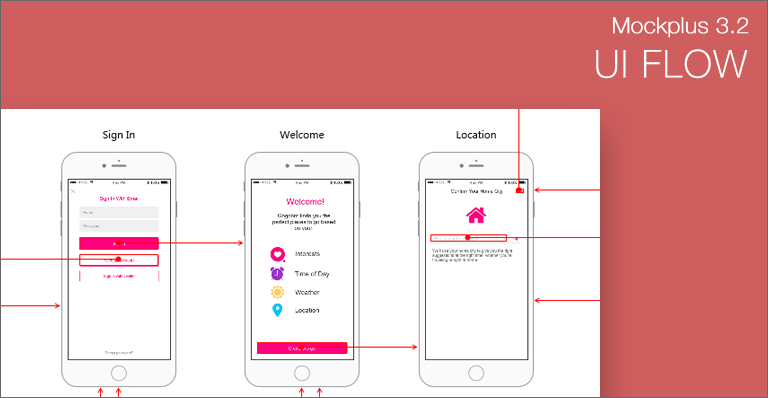
Wireframe helps to clearly show the logic and structure of the work, which could reflect your page layout, whether the placement of components is reasonable, and even the theory that supports your design. Using prototyping tools such as Mockplus is a good choice. After the wireframe is finished, you can export the UI flow directly, and you can also test and share your prototype online.
Step 3: Showing design process
Every part of your portfolio is a journey. You need to show how the mind evolves and how the design iterates all the way. Also, you should show how you divide information modules and how to rank important hierarchy.
Step 4: Enhancing the navigation of the work
No matter how beautiful your work shows, how fun the layout is. However, if the navigation is not clear enough, the interviewer will lose the patience of carefully browsing. At the same time, we must try our best to ensure that navigation on computers and mobile phones is quick and easy.
Selecting right showing platform
There are so many online platforms that can show your work. No one is unique. What matters is how to communicate and interact actively with your audience.
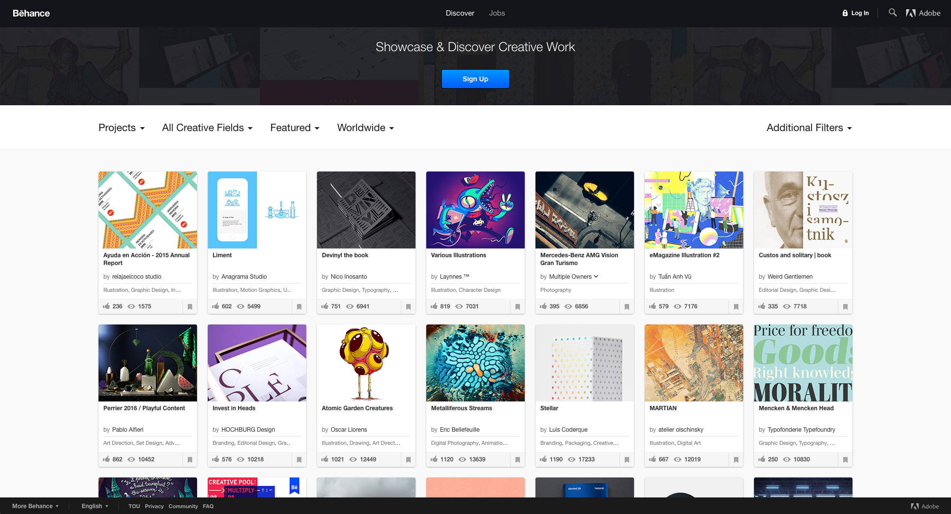
(1) Behance: As the world's largest creative community, it has incomparable traffic in the design field. When you upload a work, it will be fully displayed in this huge community designers, what you should do is just waiting for others to give you praise and comment.
(2) Dribbble: As long as you are a designer, you certainly know Dribbble. This is a place for designers to showcase their work, communicate with peers and find inspiration. Graphic designers, illustrators, font designers and icon designers have their own place. However, this community is invite-only, you can upload own work only with an invitation code.
(3) Tumblr: as a microblogging, it’s ideal for the expression and display. But its comment and interaction mechanism is relatively weak.
Get inspiration from following amazing UI portfolios
Yitong Zhang
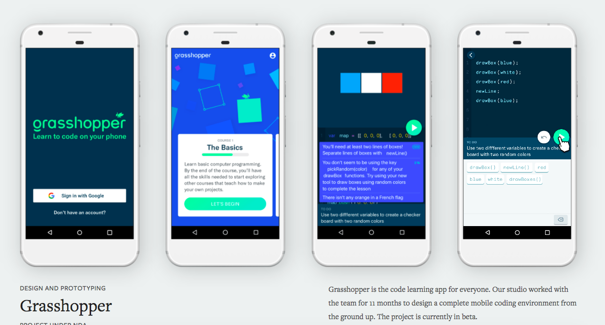
What sets this collection apart is the way designers tell stories. From his personal experience to his work, the way of communication is very structured. When you browse the design documentation for this project, you are impressed by his linear work patterns.
Liz Wells

The advanced UX designer Liz Wells from Brooklyn shows on her page a few selected projects for Google and Spotify. She demonstrates with short screen videos how to use the finished applications. The thumbnails appear on the start page as a large-scale hover effect.
Christine Walthall
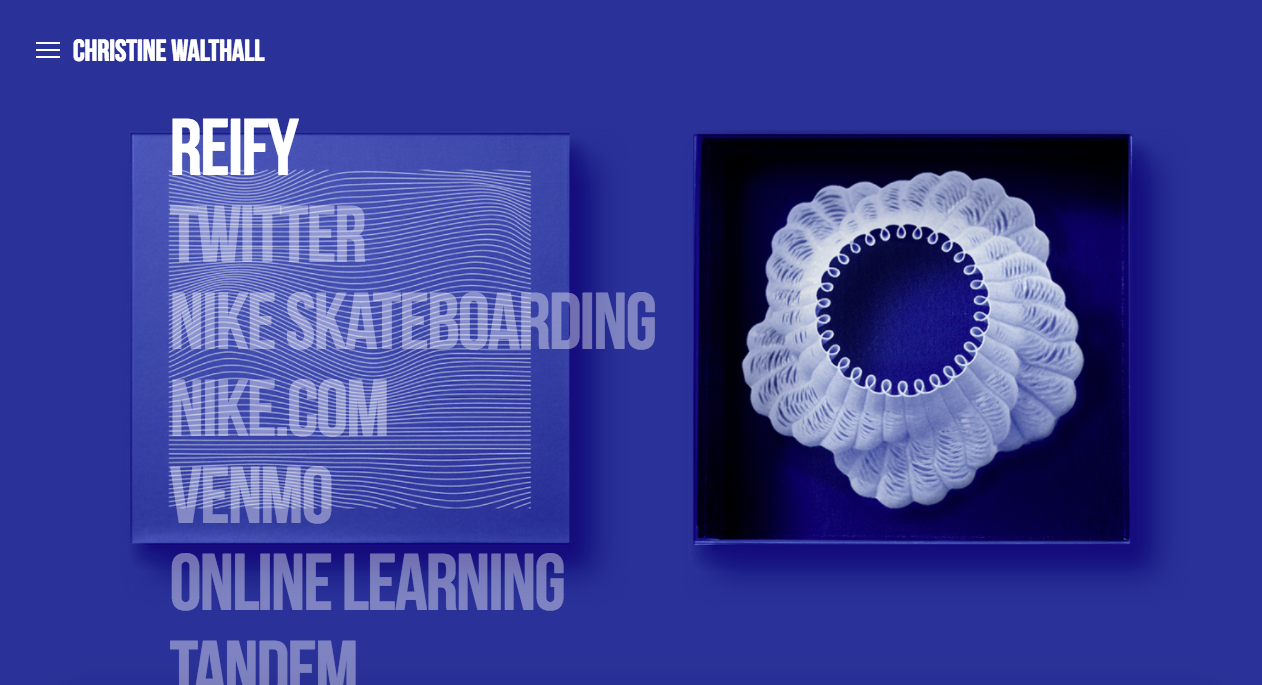
Christine Walthall, Los Angeles-based UX expert, uses sitemaps, wireframes and navigation flows to document her work. The start page shows large-format thumbnails instead of a grid.
Martin Oberhäuser
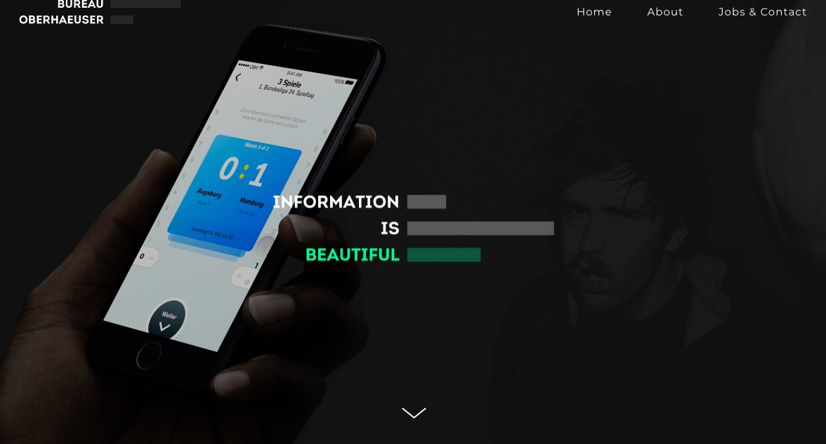
The Hamburg interface expert Martin Oberhäuser breaks the typical grid arrangement with larger boxes that refer to social media channels or blog posts. He always presents interfaces in animated form, sometimes with animations or videos showing an app in action.
Adrian Zumbrunnen
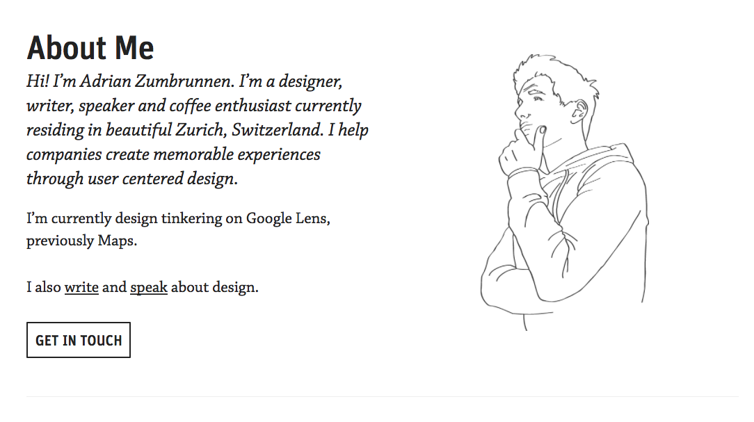
On the site of Adrian Zumbrunnen, you are welcomed by a conversational interface with humor. The designer from Zurich uses it to ask website visitors to contact them - coffee or tea included.
Orange You Glad
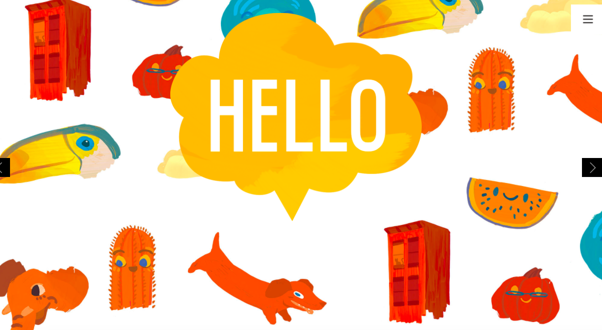
The agency Orange You Glad from Brooklyn pays attention to a nice greeting of potential customers: Many different illustrated »hellos« plays by turns on the start page.
Nick Jones
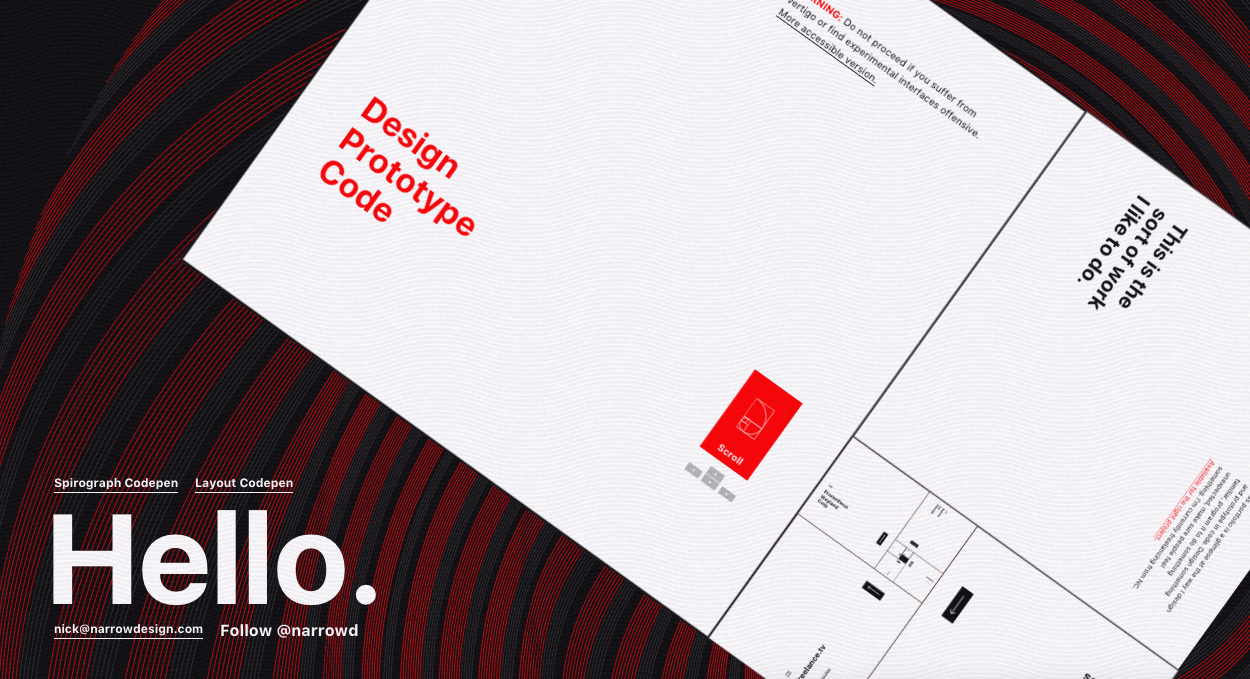
Nick Jones, interface designer and prototyping designer from North Carolina, has made a special turn for his site. The spiral interface moves clockwise when scrolling. In case of dizziness, there's a harmless version of the page.
Chantal Jandard
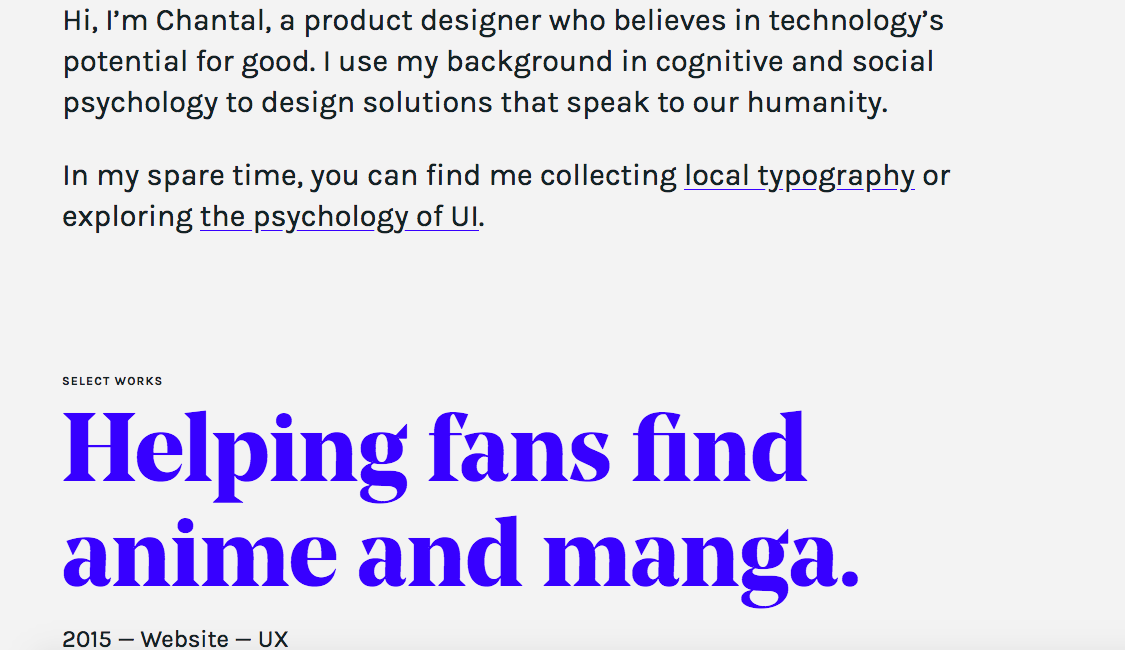
Chantal Jandard abandons photos on her homepage. Instead, she chooses extra-large headlines that summarize her task.
Conclusion
Your UI designer portfolio simply shows what you did and how it was done. Over time, the only limitation is your experience and precipitation in design. Enhancing yourselves with great concentration is the best way to win your ideal job. Hope that the above experience and examples can bring you full inspiration, making your UI portfolio standing out.
Comments
Post a Comment