How to Be A Completely Failed UX Designer?
Everyone says that it is hard to be successful design master. Well, you think this is easy to be a completely failed UX designer? To be honest, I don't think that would be easy. So, how to be a completely failed UX designer? At least, you need for these things below.
1. Never care about users' feedback
Everything's tough in the beginning. But, it is a great start when you choose to ignore users' feedback.
So, how to completely ignore users' feedback in details? First of all, don't do any user research, none of them. User-research is one of the most important ways of getting users' feedback. It's like a guide for new product designing and improvement. If you want to be a completely failed UX designer, then please don't do any research.
Also, please stay away from any kind of testings. Testing is the examination of your prototypes and your designs, especially when the testing has included the advice and suggestions from the users. They will send you some really valuable information, such as the necessary of a certain function, the rationality of a certain interaction. Stay away from testing, stay away from being a good UX designer.

2. Anti-human interaction designs & use the wrong prototyping tool
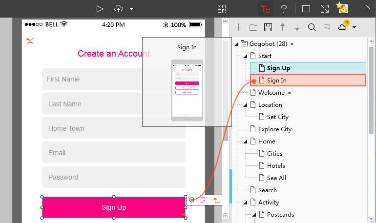
Prototyping is an important part of UX designers' work. How to set an interaction which is anti-human? Well, it's pretty easy. Just popup a window that comes out of nowhere. The less logistic you make, the better you have made. But, it seems that you can find this situation in many apps.
As for the behavior of misusing prototyping tools, it should be more common. So, may I say that many of us have a great potential for being a failed UX designer.
First, don't use a prototyping tool at all. Just give the hundreds pages word files to your developing team, and just consider they are stupid if they can't understand what you're saying.
Second, use align prototyping tools like Mockplus, Proto.io or UXPin to do some really complicated interactions, like value changing and judgement.

Third, insist using Axure, Justinmind, FramerJS, etc while you're requested to do a rapid prototyping.

Fourth, use Flinto and even InVision to show the interaction among components.
When you have achieved all the four things above, you have been closer to a completely failed UX designer.
3. Ignore user-friendliness
3. Ignore user-friendliness
User-friendliness is the most important part of user experience, let user-friendly go to hell, all you want to be is a completely failed UX designer, right?
Here are some examples you should not follow, please avoid doing so.
Our first example is an app: Bilibili. As an app comes from nijigen, B is really good at being cute. Well, how to improve user-friendly by being cute?
While you're logging in, the twins will look at you with big smiles. But when you are inputting the password, the twins will cover their eyes with hands. That's a sense of safety. Well, cute, but in a safe way.

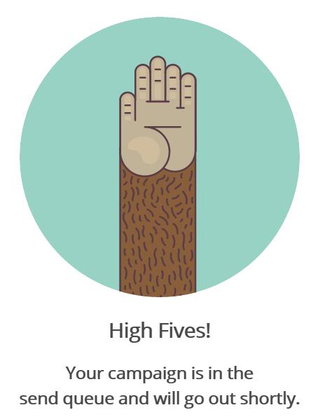
Being cute is not a thing just for girls, there's a chimp also good at this, plus he can help you send emails. He's Mailchimp.
Every time you have finished a campaign, there will be a chimp waiting for to Hi-Five with him. It always makes you feel happy after you have spent so much energy at creating this campaign.

Also, you can find more prototypes here.
To be honest, there are many things you need to do if you want to be a completely failed UX designer, these three points are just a few part of them. But, they are really important for you too. So, have you found out that you're already on the way of being a failed UX designer?
Comments
Post a Comment