You Have No Idea How Today's Mobile Interface Design Is Like in China
Two years ago in China, “mobile interface design” was just a catchy buzzword. But with China’s internet giants going global and domestic users’ becoming pickier and pickier, designers and PMs are in return forced to uncompromisingly pursue the perfection of app ui design.
You can have a sip of five examples below to get an idea of China’s mobile interface design. These Apps, I believe, have a sense of design which many western-designed Apps lack. To be more specifically, I assess them in three aspects:
Interface: The mobile App screen design should stand out. Every tiny detail in the interface should combine to be the prove of the uniqueness of the App. Even if it insists on the pursuit of beauty at the expense of usability, users are reluctant to delete it.
Function: Exquisite content and distinctive function will automatically improve the spiritual disposition of the App. Like those outstanding photo editing Apps like VSCO Cam who have done great mobile interface design, its functions also offer a possibility for users to create their own customized output. This is also a sense of design that creates value for users.
Experience: The comprehensive digital user experience when using an App is related to the two aspects discussed above, but it covers a wider range. The experience of high quality covers the sense of joy brought by a line of a quote as well as the improvement of life style.
1.Eyepitizer
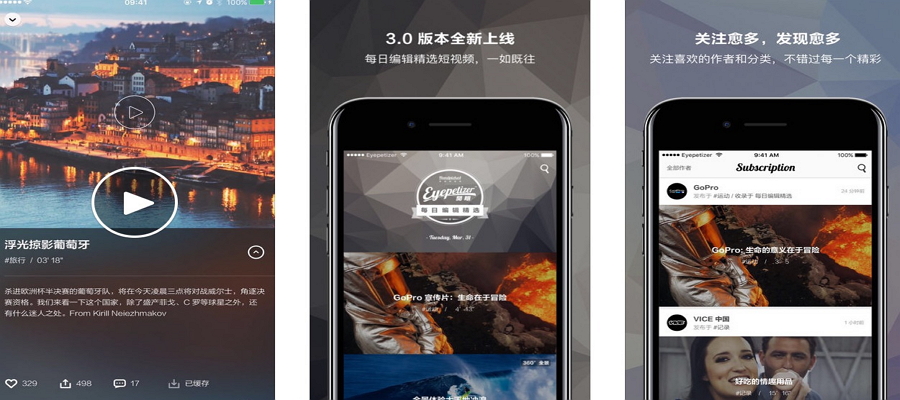
Eyepitizer is a video platform providing high-quality short videos worldwide, providing you 5-10 videos everyday for you to explore. Its mobile interface design is amazing from the opening page to the selecting icons and all the smooth dynamic animations. It also supports 360°panorama videos for users to experience VR without any accessories.
2.One
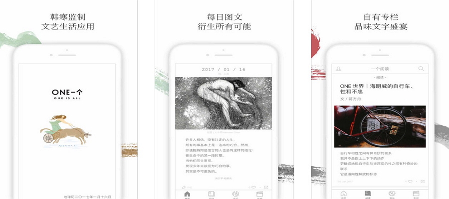
The idea of ONE came from one of China’s most widely read writer, but it’s not the only reason of its being the most content-rich App in China. ONE gains a sense of design mostly from its content through only publish one photo, one article, one movie comment, one quote everyday. It not only successfully become an amusement park for photographers, travelers, designers to share their lives, but also build a library for average people to read and learn. This App reminds us that “One is enough in a complicated world”.
3.Wood Joints
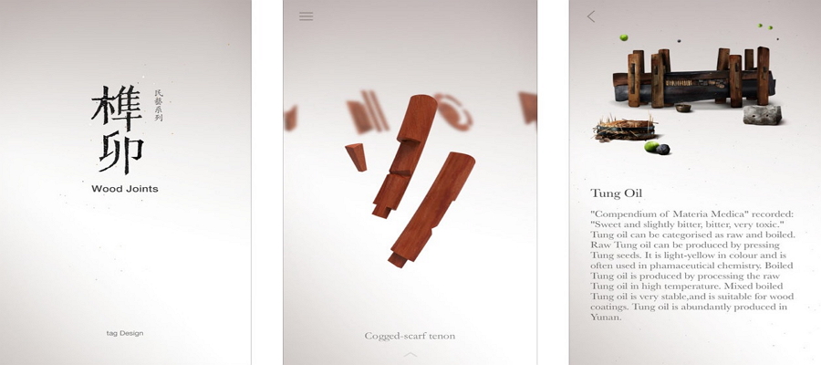
Wood Joints provide a high-quality 3D model to view the 27 classical tenon-and-mortise joint structures broken down into their component parts. Facing the difficulty in mobile interface design, It’s not just a game solution, users will unconsciously experience the long history of the Chinese craftsmanship in both architecture and furniture. Wood Joints actually reaches the peak of App material design in its own meaningful way.
4.Duha(Android)
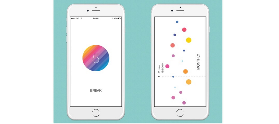
To be honest, Duha is my first Tomato timer APP. I’ve tried several Apps of this kind after Duha, but Duha remains my favorite because of the emotional texture of it: it replaces traditional-used tomato with a rainbow balloon; you drag the rope to “fly” an hour unit of time; the sound of releasing the balloon makes you relax and get to work. Designers putting Elements like childish things in the mobile interface design process, in fact, making the Timer more adherent.
5. Daily Cost
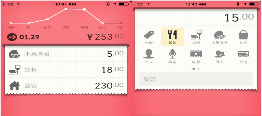
As an accounting App, Daily Cost stands out for its material design. It allows you to record and track your expenses by tearing down the bill. Everyone knows how to use it on the first sight and it takes just 3 seconds for recording every single expense. Animations and interface elements design are both exquisite and smooth. By the way, the icon designs are so beautiful that you can’t help tapping it for fun.
Comments
Post a Comment