Top 6 Widely-Recognized Web Design Trends of 2018 and Beyond To Watch
Every designer has passion to keep updated with the latest industry news, and it’s of necessity to know about the most recent trends especially web design trends in 2018 in the field. As web design is so dynamic and changes rapidly with the technology evolving, ideas that may be considered experimental become mainstream, while some design components that may be mainstream finally become obsolete.
Obviously, it’s a continuous process of obtaining new knowledge and skills, and let’s take a prior at what will be the design trends for web design in 2018 and what design approach will be the new darling in the coming year.
Top 6 Web Design Trends for 2018
1. Gradients and Translucent Design
• Tools Recommended -PS/AI
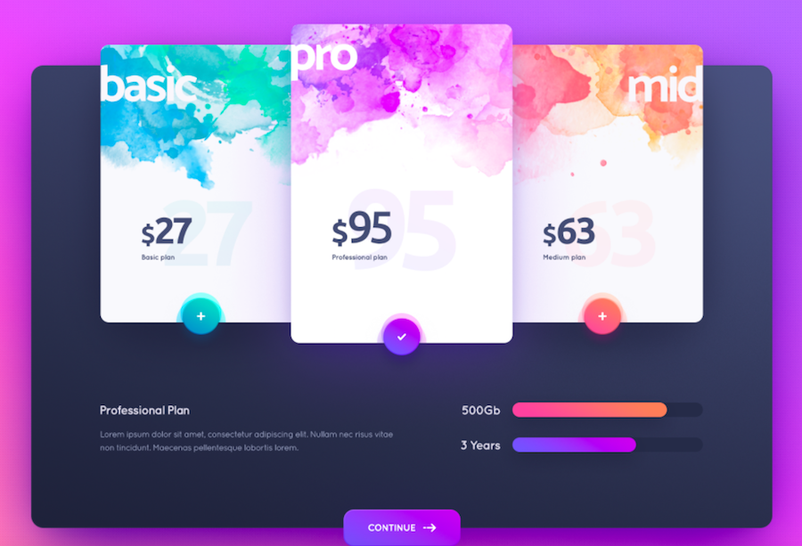
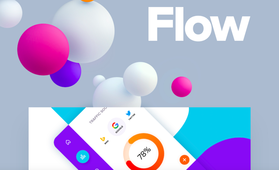
The use of gradient can be found almost everywhere in the web design, like in the logo, button or just the background. The employ of brighter color, bold graphics and gradients can frighten many businesses in the past years, while those elements are gradually taking over web pages and even replacing many traditional elements like photography.
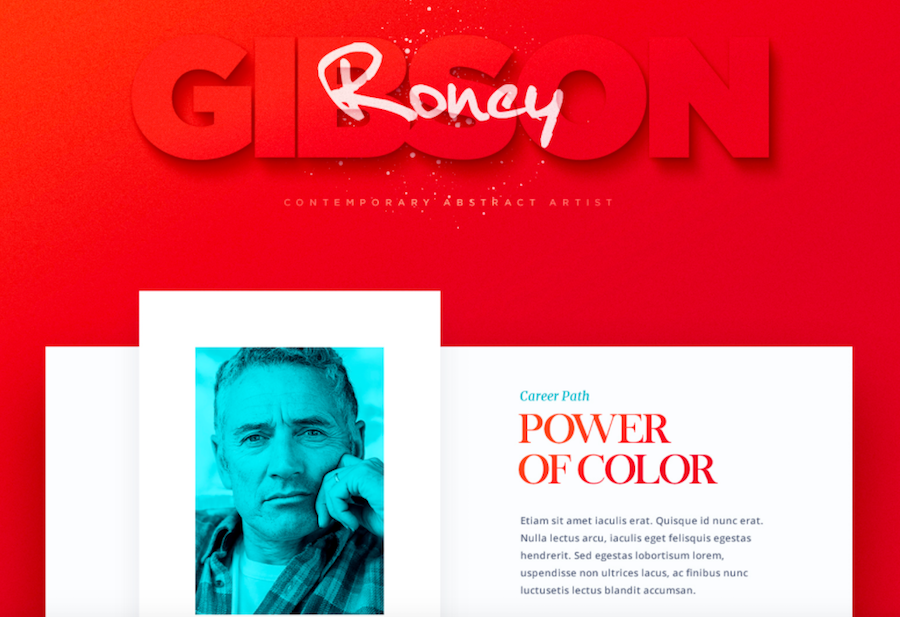
To use transparency in your design can be a risky but awesome work. If used properly, the translucent design can enhance the overall design and layout without affecting the page readability. It can also make a transparent stained glass texture, here is an example for your reference:
2. Semi-Flat Design
• Tools Recommended -PS/AI
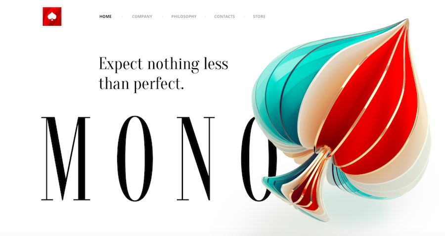
The flat design can be the most popular but controversial design trends in the past years. No matter what kind of design trends, it can be affected by the joint-force of media, technology as well as the usability, and will get integrated in our design in a gradual way, with a period of 1 to 2 years. As a matter of fact, there are already many designers who have re-defined and improved the approach of flat design – that’s what we call Semi-Flat Design here.
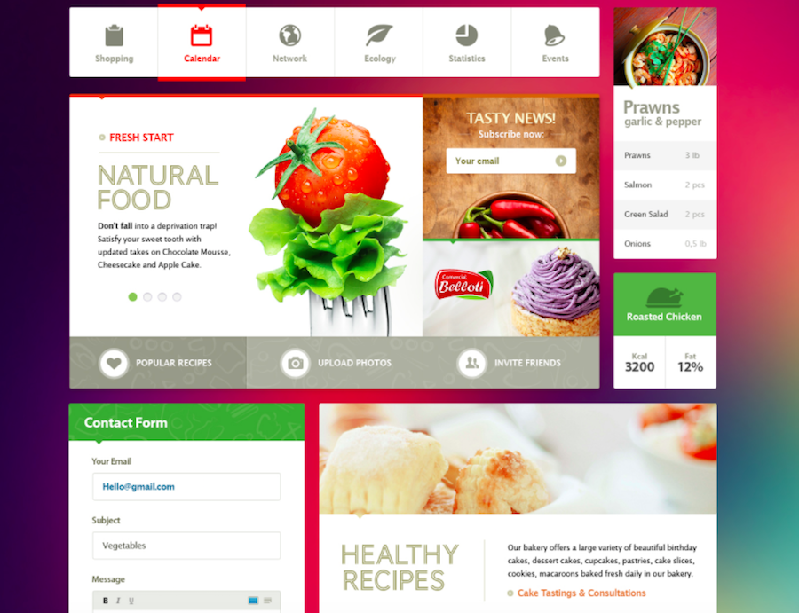
It can be the perfect combination of both material design and flat design, which add a sense of space on the given design, including the card design and floating button. This enables users to better acknowledge and accept the page elements, full of principle and predictability.
3. Three-Dimensional/3D Design
• Tools Recommended - C4D
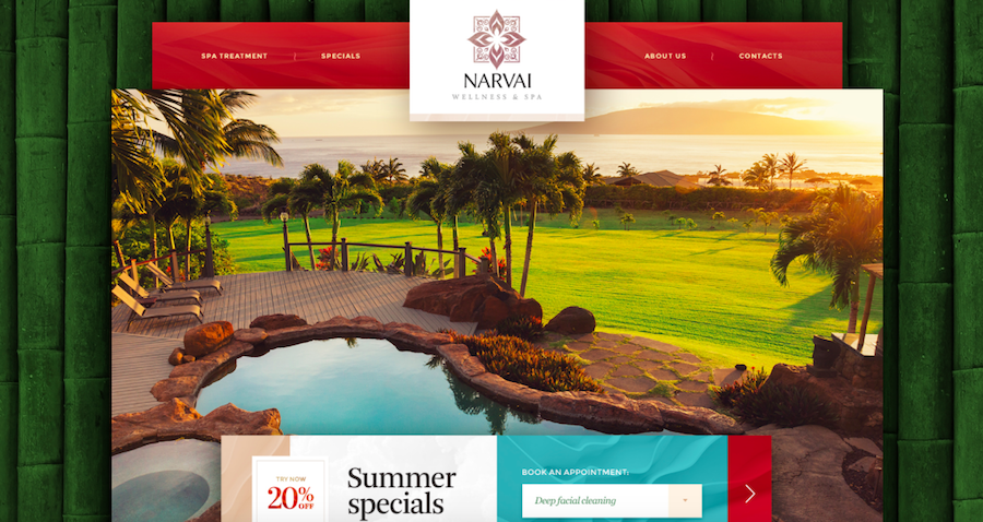
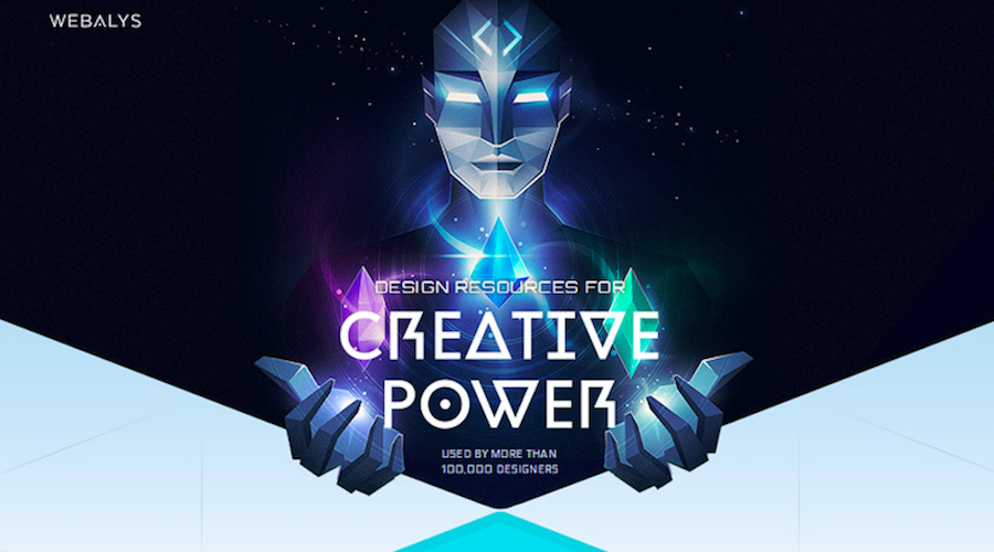
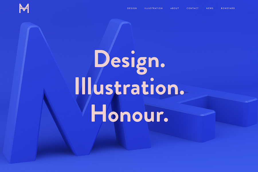
Out of all kinds of science fiction works, we can easily find that those words like “space-time distortion” and “overlapping” have become the buzzwords. The use of two-dimensional/2D design can be common in the past UI design, but from the very beginning of this year, it’s poised to adopt more 3D effects. This will undoubtedly add fun to design and enrich the content.
To create a sense of space has been attached growing importance in the visual design, and it will bring a good shadow effect by re-arranging the place and spacing of page text.
4. Micro-Interaction Design
• Tools Recommended - AE
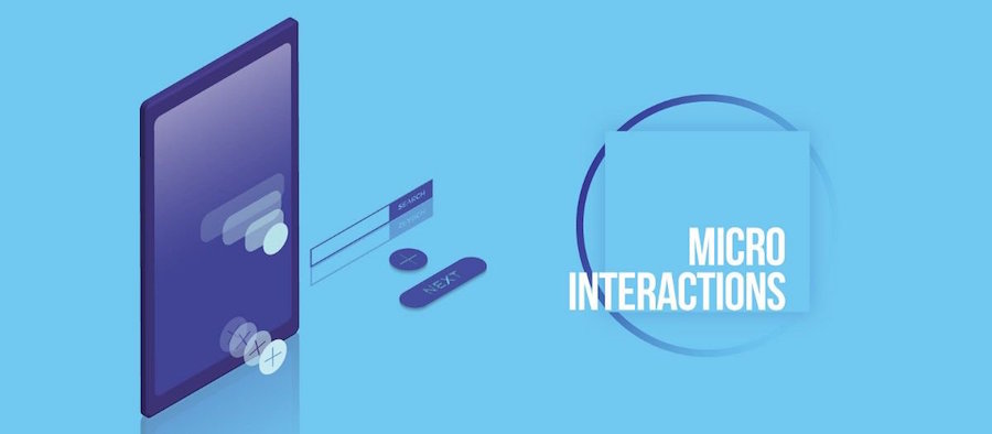
Good features and details is what makes a good product. Users will get attracted to use your product for the in-built features, while the details can be a decisive factor for your user retention. Micro-interactions are part of the small details that can make a website either great or just homogenous/boring.
It’s no exaggerate to say that we will endure hundreds of micro-interactions everyday. For instance, when you set the iPhone mute, it will be accompanied by a vibration reminder, plus a mute icon on the screen. The micro-interactions add a level of richness to the website with an added layer of branding included.
5. Responsive Design
• Tools Recommended - Frond-end and coding knowledge
Originally put forward by Ethan Marcotte in 2010, the concept of Responsive Web Design has quickly taken over the frond-end and design world, and is now a irreversible trend in web design. The definition of it from Wikipedia:
“Responsive web design (RWD) is an approach to web design aimed at crafting sites to provide an optimal viewing experience—easy reading and navigation with a minimum of resizing, panning, and scrolling—across a wide range of devices (from desktop computer monitors to mobile phones).”
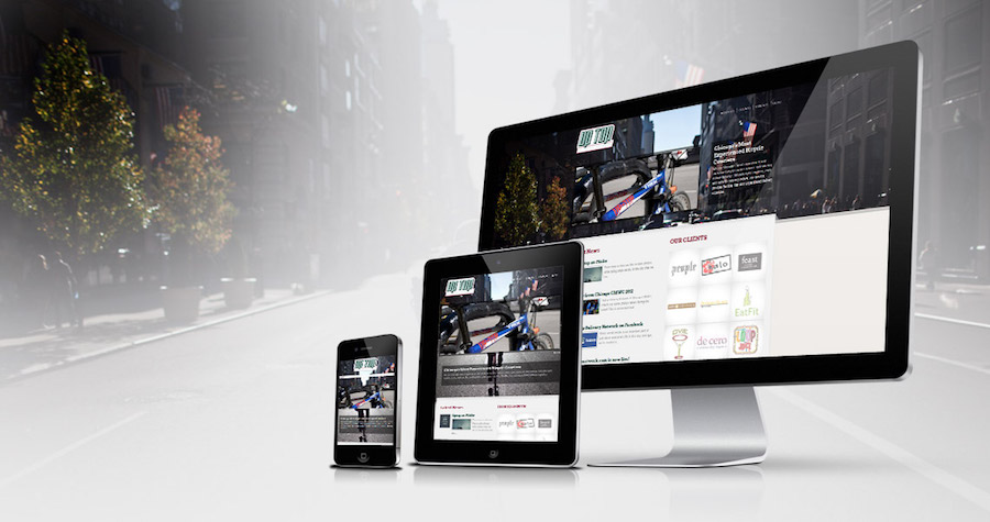
The flexibility to be applied on multiple different screens is where the responsive design comes in handy. This is exactly what developers always pursue where the coding can be written just once but can used everywhere.
6. Minimal Prototyping & Interactive Design
• Tools Recommended - Mockplus
Focusing on the simplicity or concise layout will be another mainstream trend. The aim of minimalist design is to solve user problems by clear visual communication, putting more attention to page content not interface. By reducing the distracting elements, this kind of design approach lets users better focus on the content. A minimalist UI with good usability can bring a smoother experience, and a design tool with a clear interface and operation will become the king of tool.
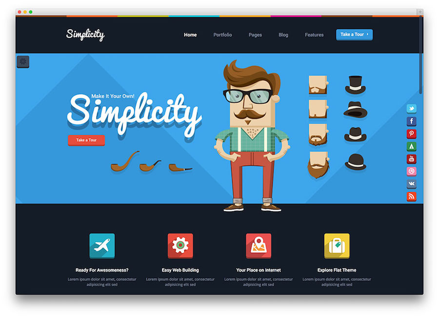
At this point, we’d recommend you to use a rapid prototyping tool named Mockplus whose mission is to let users focus on the design not the tool itself. There are many features for your better and faster design:
- Drag and drop to make interactive design between pages and components, that’s WYSIWYG.
- Up to 200 ready-made components and 3,000 icons, with a set of page templates (for different device size and categories) to get started quickly.
- Add unlimited team members and invite unlimited reviewers in your team project to reduce the communication cost and improve the team productivity.
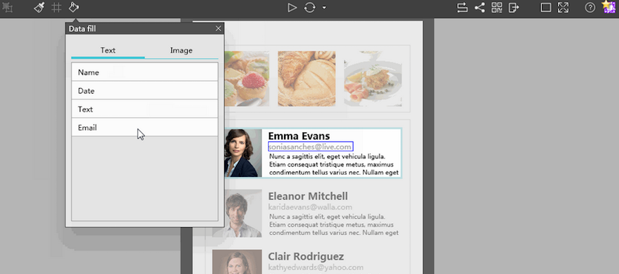
- Auto Data Fill and Repeater features will save you much time creating/searching repetitive elements and thus reduce your workload a lot.
Best Web Design Examples
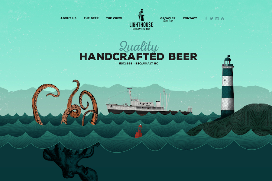
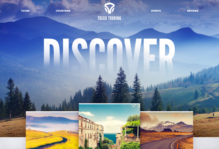
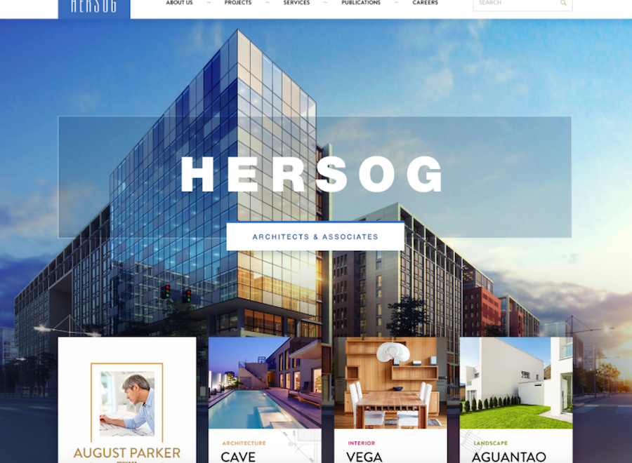
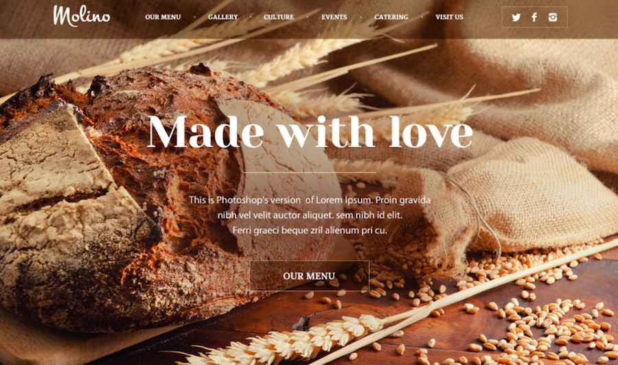
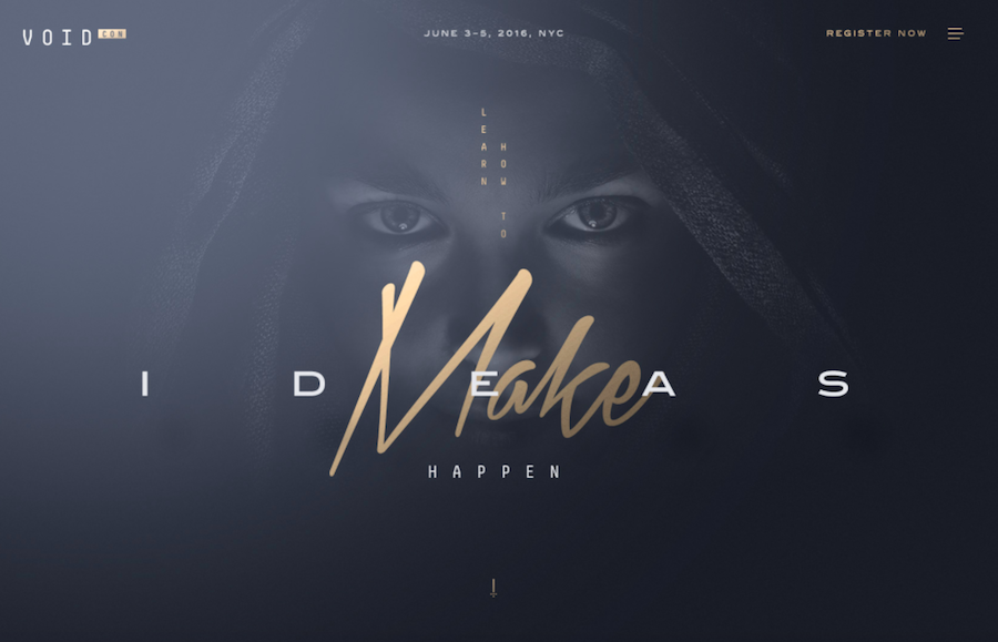
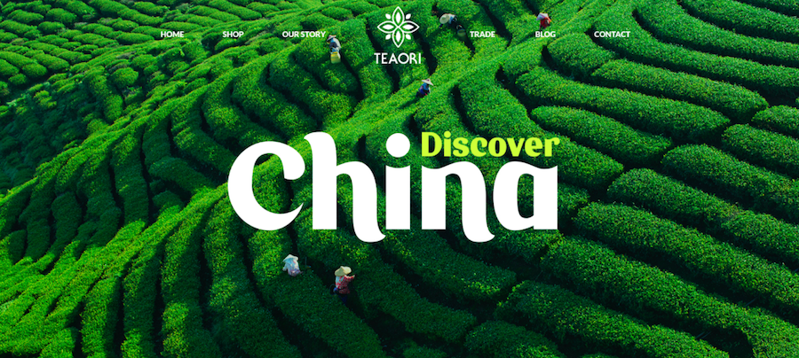
To know cutting-edge trends and make monitoring of changes that occur is a must for every designer, and websites like Dribbble is a such great place to get your needed information. Here, we’ve rounded up the top 8 design examples from Dribbble based on the newest homepage web design trends. Enjoy!
Wow! These are really amazing trends. I also provide Web Design Services in Kenya and I had checked out many web design trends but I find these trends very fascinating. I really appreciate your work thanks for posting.
ReplyDelete